Our Trek Comics editor Patrick Hayes is back with a review of this month’s issue of IDW Publishing’s Star Trek ongoing comic series: the first part of “I, Enterprise.”

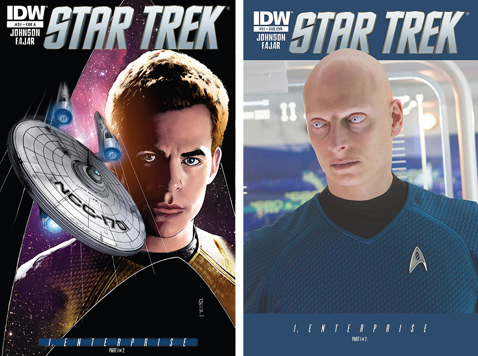
The regular cover by Garry Gastonny (with colors by Sakti Yuwono of Stellar Labs) is a nice bust shot of Kirk with the Enterprise speeding through space, framed by the familiar delta shield. This is drawn well, and I always enjoy when the artwork goes slightly beyond its panel borders; makes the illustration seem more immediate. The coloring is very well done, especially on Kirk, giving him a more three dimensional appearance. Grade: A.
Of the two covers, the subscription cover is the one to get! There has never been a photo cover focusing solely on a supporting character, and Science Officer 0718 — played by Joseph Gatt in Star Trek Into Darkness –– is the first. It’s a pretty startling image for a Trek cover, and if it weren’t for his white eyes I would have thought him to be a Deltan.
More of these covers, please! Grade: A+.
“I, Enterprise” is the first of a two-part tale focusing on the origin of 0718. On the inside front cover, underneath the credits, it states, “The U.S.S. Enterprise has embarked on a New Five-Year Mission after the events of Star Trek Into Darkness. Among the ship’s new crew is Science Officer 0718, whose remarkable origin has remained a mystery…until now.”
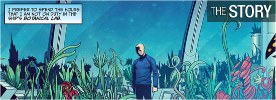
That sums up exactly what this issue is all about from writer Mike Johnson and story consultant Roberto Orci. The book opens with 0718 manning his duty station on the bridge; readers learn what he does and what he thinks of his responsibilities. These first pages were fairly straightforward, but a nice character trait is given on Page 4, revealing what he does when off duty. This section of the ship hasn’t been seen since the Original Series, and I’m glad it’s on this Enterprise.
The origin begins on Page 5 and it’s full of solid moments. The bottom of Page 6 and the top of 7 have a perfect Kirk line. I enjoyed how Uhura was a necessary component of Page 9, as Nichelle Nichols was woefully underused in the 1960s. I was impressed with Kirk’s decision on 10, making him more responsible than Shatner’s version. The incident on 18 was a surprise, even if that individual was wearing a red shirt.
When Page 20 began I knew exactly what would happen, and it did. However, I enjoyed it and I dare anyone reading this not to hear ominous music in his or her head as it’s happening. This was a good start, and, like the good storyteller he is, Johnson ends the issue just as it’s going to get really interesting. Grade: A.
Another mixed bag for artwork in this issue.
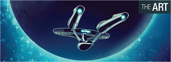
Artist Erfan Fajar definitely knows how to lay out his pages and panels for a smooth read. Page 1 is like a movie: a tight close-up of the main character, pulling back to see him in action, pulling back further still to see him in relationship with a familiar lead, and then a refocus on him to emphasize his narration. The double-paged spread on Pages 2 and 3 nicely shows how 0718 focuses on his different tasks while spotlighting the cast, with a decent illustration of the Enterprise. I say “decent” because that saucer section looks a little too stretched.
This is a good example of why I feel the way I do about Fajar’s work: things are going along fine and then something odd appears and pulls me out of the book. Another example: Page 4 looks great except for the close-up of his eyes which are overly shaded for depth. I could rant on about oddities, but I’ll focus on the good: Page 5, 6, 10, 14, 17, the good action beat at the top of 18, the medical event on Page 21 hat could have been a lot more graphic, and the clever, concealing waft of smoke on Page 22.
The resemblance to the actors is pretty good, but I think a lot of that credit goes to the colorists who sell the final version. Good, just not consistent. Grade: B–.
Cover colorist Sakti Yuwono with Ifansyah Noor, both from Stellar Labs, are doing much of the heavy lifting when it comes to the visuals on this book.
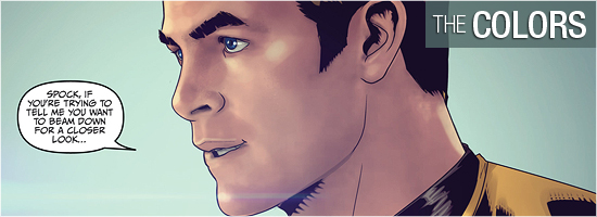
Such work isn’t really noticeable until several close-ups occur on characters we know, like some of the tremendous work on Spock seen on Page 6. Just look at the shadings and highlights created by the setting on his face — it’s almost photo-realistic. Check out his uniform in that first panel. Fajar did some appropriate line work on it, but Yuwono and/or Noor took it to the next level. The same can be said for the faces that appear on 7 — they look amazing! In fact, the entire four page sequence is tremendous.
The work on the entire book is good, except Chekov and Scotty’s hair was a little too blonde. That’s a minor nit in an issue filled with stellar work. Grade: A+.
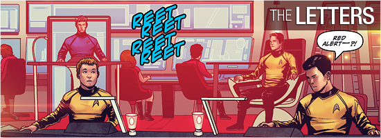
Narration, dialogue, red alerts, a shock, and two other sounds comprise Robbie Robbins’ work on this book. All are done well, but no transporter sounds during beam-down? How can IDW not include that iconic sound whenever it happens in this series? Grade: A–.
Bottom line: “I, Enterprise” is the start of a great story, but the inconsistent artwork keeps this one from becoming a classic. Grade: B+.
– Reviewed by Comics Editor Patrick Hayes
![]()
 |
|||