Our Trek Comics editor Patrick Hayes is back with a review of this month’s issue of IDW Publishing’s Star Trek ongoing comic series: the first chapter of “Lost Apollo.”
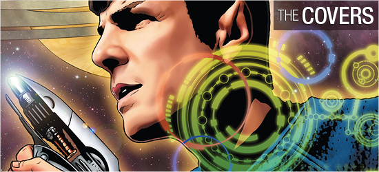
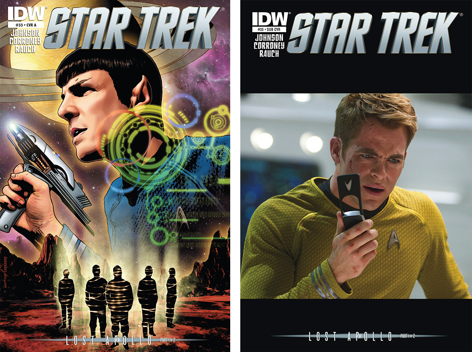
Interior artist (and one of my favorite all time artists) Joe Corroney provides the art for the main cover with a gorgeous shot of Spock with phaser ready, from a classic scene from the 2009 film. There’s a really cool computer overlay atop part of his image, while below an away team is beaming to a desolate planet’s surface. I love this art, and the colors by Brian Miller of Hi-Fi just make it all the more awesome. Grade: A+.
The subscription cover is another photocover, this time showing Chris Pine as Captain Kirk looking stunned at information he’s just received via his communicator. I love this image; IDW has really hit a good streak with these variants. Grade: A+.
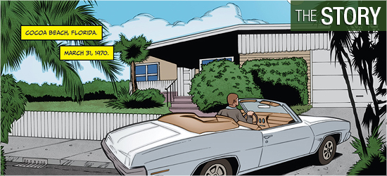
Mike Johnson’s “Lost Apollo” begins in the most unlikely place: Cocoa Beach, Florida.
It’s March 1970, and Steve comes bounding into his house radiating joy as he’s been chosen by NASA for an Apollo mission. His wife is happy for him, but not thrilled with the timing since she’s very pregnant with their first child. He responds with a smile, saying, “Don’t worry sweetheart. It’ll be years before we’re ready to launch. But when we do, heck… I’ll be going where nobody’s gone before!”
Page 3 opens two hundred ninety-one years later, in orbit above the unexplored planet Hinrichs V. Lieutenant Sulu is asking Captain Kirk if he can be part of the away team that’s about to beam down to the planet. Lt. Marcus weighs in with an unsolicited opinion, which gives Kirk a nice muttered response. He relents, to which Sulu says he owes Marcus.
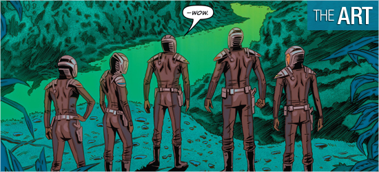
Before Kirk can leave the bridge, Spock stops him and questions the necessity of their beaming. What follows is a classic Trek question: why go to the planet, when the vast technology on the Enterprise can accomplish the same goals safely from orbit? The planet’s surface is nothing like we’ve seen the crew visit before. The beauty of the world only builds tension for the inevitable, and they come across the inevitable on Page 11.
It is remotely related to the opening two pages, but will hopefully be explained fully next month, as an exit is required that readers know will not go smoothly. The situations that occur during this exit are pretty rote material as they build to a cliffhanger for. A little more relation to the opening pages might have increased my enjoyment. Grade: B+.
The pencils on this issue are by Joe Corroney, who inks some of his work this issue, with Victor Moya and Rob Doan inking other parts. The opening pages are appropriately dated. All I could think was, ‘You’re not watching Mad Men, it’s Star Trek.’ The third page’s Enterprise is gorgeous and the fourth page’s characters look fantastic.
But Corroney does something I’ve not seen him do before with some of his backgrounds: a few panels are obviously sourced from photos, and it really doesn’t meshing well with the rest of the art. Those panels stand out clearly as photocopies, and they’re an unnecessary distraction. I would rather there be no drawn backgrounds than have these. For example, Page 5’s first three panels are using this technique, and they’re a blurry mess.
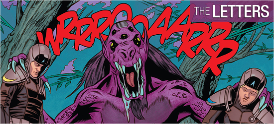
Panels 4 and 5 have Corroney doing original art for the backgrounds and they look terrific. Even the final panel, which has no background, looks superior to those first three. Things improve once on the planet which fully warrants Kirk’s “…wow.” There’s a nice Jurassic Park homage, followed by some fauna of a different sort. The action on the planet is good, with the final two creatures being slick.
I’m bored to tears with the creatures that seem to populate sci-fi movies created by Neville Page and Patrick Tatopoulos. Corroney gives me the aliens I want and need, and not the blasé Hollywood creations. I’m liking all of this, save the photostated backgrounds. Grade: B+.
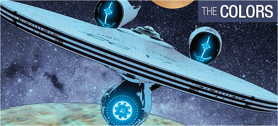
Excellent coloring on this issue by John Rauch, who sets things up perfectly in the past before transitioning to a beautiful Enterprise orbital shot. The interiors of his Enterprise are powder blue with nary a lens flare in sight, hooray!
The coloring on the planet is great, capturing a good mixture between past and present Trek with dim colors and splendid brights that hearken to the 1960s. Grade: A+.
Scene setting, dialogue, transmission, and four sounds come courtesy of Neil Uyetake. All are done well, but I need a transporter sound when characters beam about. Not having this iconic sound is like ignoring lightsabers in a Star Wars comics. It should not be avoided. Grade: B+.
Bottom line:
The first part of “Lost Apollo” was enjoyable, but I’m really hoping next month’s follow-up will kick the story up a notch. Grade: B+.
– Reviewed by Comics Editor Patrick Hayes
![]()
 |
|||