Our Trek Comics editor Patrick Hayes has his review of IDW Publishing’s second City on the Edge of Forever comic adaptation, based on writer Harlan Ellison’s original teleplay.
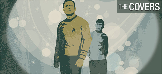
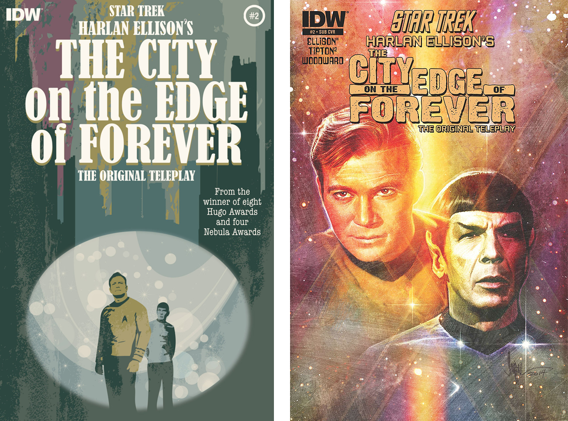
Juan Ortiz provides the artwork for the regular cover. Kirk and Spock look through the iconic portal and outside of its entrance is a sweet skyline from Earth’s past. Oritz continues to dazzle with his interpretations of classic Trek. It makes me think of an Andy Warhol print. I may be getting ahead of myself, but my fingers are crossed that this image will become a T-shirt or print in the future. Grade: A.
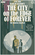
The subscription cover is by Paul Shipper, showing bust shots of Kirk and Spock against a brightly colored yellow and violet starfield. Nice renderings of both characters, reminding me of the artwork of Keith Birdsong. Grade: A+.
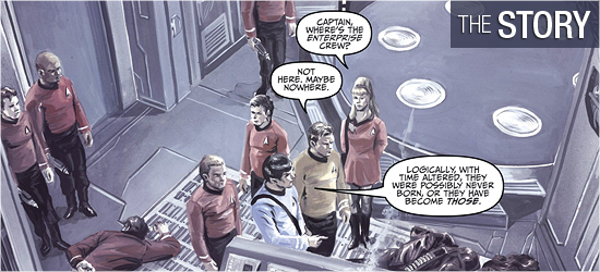
Picking right up from last issue, Beckwith has gone through the portal and changed time. So drastic is the change, the Guardians leave the Enterprise crew saying, “The machines of the ancients are registering traumas in time. We must return.” Return where? That’s a question that’s beyond the scope of any human. After their disappearance, Kirk quickly realizes they have to go back to their ship.
Wisely, Kirk has the security team beam up first, while he, Spock, and Rand beam up seconds later. What could possibly go wrong when the red shirts are separated from the command crew?
What they find in space will surprise readers. This wasn’t in the aired episode, so this is new territory for those who haven’t read Harlan Ellison’s original teleplay. Scott and David Tipton are doing a bang-up job on this adaptation. I love that a supporting character starts the action on Page 6 and engages in fisticuffs on Page 7. Back on the planet, the Guardians have returned to speak with Kirk and Spock, having a wonderfully dismissive line at the bottom of Page 9.
The speech given on Page 16, sadly, is reminiscent of words currently being said in America, creating an eerie “What have we learned?” moment in the story. I was shocked by Kirk’s solution for a speedy escape on Page 19; I would have behaved as the onlookers do at such an exhibition.
I’ve seen this episode countless times and read the screenplay twice, yet this is completely fresh in this format. Grade: A.
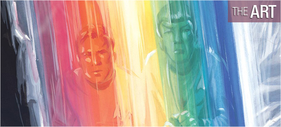
This book is gorgeous on every page. J.K. Woodward does an exceptional job on the characters’ faces: Kirk’s emotions are stellar, portrayed well on several pages; you can really feel the frustration rushing out of him. My favorite image is on Page 4, with the captain giving a flying leap — elbow first — into a foe. How could a Trek fan not love this pose? Spock is great and Rand is fantastic throughout the book.
The settings are wonderful, with the icy world of the Guardians giving The Empire Strikes Back’s Hoth a run for its money. The the orbiting ship is excellent, and Earth’s past is a blast (with some familiar names appearing on businesses). Page 14 has a transition that could have been very awkward. There are several ways this could have been accomplished but what Woodward has done is the perfect way to pay homage to the effects of the original series, yet make it look modern. Really, really well done. This transition has a great ending at the bottom of Page 15, with Spock looking just awesome.
When things get hostile with the natives, Woodward smartly tilts the perspective in several ways. Page 18 begins with a great shot looking upward at some antagonists. The next panel is almost at a 45 degree angle for the action that occurs, which makes what transpires more intense. The final two pages continue these askew views, making the action dynamic.
I also have to draw attention to the coloring. The explosions and sounds that begin on 4 are powerful because of their hues and Page 13 made me think of the classic poster for Star Trek: The Motion Picture. Woodward has brought his ‘A’ game to this book. Grade: A.
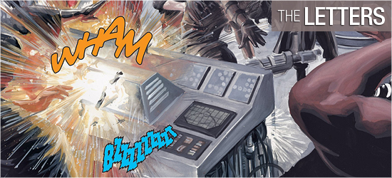
I do not envy letterer Neil Uyetake’s job on this book. I would be continually second-guessing myself as to what parts of Woodward’s art I should “cover” with dialogue balloons and sounds. Thankfully, it’s not my job, and Uyetake expertly places the text so that no art is drowning in wordage.
I was impressed with the special font employed for the Guardians’ speech which reinforces their aged appearance. Grade: A.
Bottom line: Star Trek. Harlan Ellison. The Tipton brothers. J.K. Woodward. Neil Uyetake. IDW. The ingredients couldn’t be better for a perfect feast. Dig in! Grade: A.
– Reviewed by Comics Editor Patrick Hayes
![]()
 |
Order Harlan Ellison’s City on the Edge of Forever #2 |