Our Trek Comics editor Patrick Hayes is back with a review of this month’s issue of IDW Publishing’s Star Trek comic series: the first chapter of “Behemoth,” the next entry in their Five Year Mission.
Order Star Trek #41:
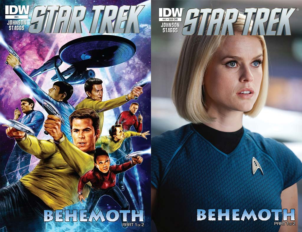
- Interior artist Cat Staggs does a sensational job on the regular cover for this issue. Kirk has a phaser blasting in each hand, with McCoy is on his communicator, and Spock shoots at an unseen foe high up. Sulu is back to back with Spock, shooting in the opposite direction. Below him Chekov ducks from something, as Scotty looks concerned, though his phaser is drawn. Uhura is shooting at something as well, and she’s not sporting her iconic skirt, but pants like the men wear. The Enterprise is above all against an excellently colored nebulae. Beautiful work.
- The photographic cover is a bust shot of Alice Eve as the new universe’s Carol Marcus. She looks sensational, and her character is a prominent player in this issue.
This is the first installment of the “Behemoth” two-parter by Mike Johnson, and the first five pages are the calm before the storm and feature some welcome down time for the crew. The issue begins with some nice narration by Chekov, revealing what he does in his leisure time. He finds he’s been joined by Irina Galliulin and they share a brief conversation before he’s summoned to the bridge.
Meanwhile, Kirk and Carol Marcus are spending time together in the crew’s mess. They, too, have a dialogue that’s ended with Kirk being called to the bridge. Once there, Spock informs his captain that they have “detected a recurring signal from the sector. Its non-random nature suggested it was of a sentient origin.”
I was so happy to see an original tale of exploration and to have it start with five pages of two pairs of crew members getting to know each other as the reader gets to know them was great. If the entire issue had just been a down time, character driven installment I would have been just as happy. I was a little bit saddened to have both couples’ moments ended.
When the ship encounters the alien vessel and tries to decipher its message I was impressed with how the four crew members worked together. It’s nice to see the teamwork of this crew reintroduced and reinforced. It was also very welcome to see the return of the crewman on Page 7 — he’s a great character who’s had two issues focus on him, and I’m glad that Johnson hasn’t forgotten him.
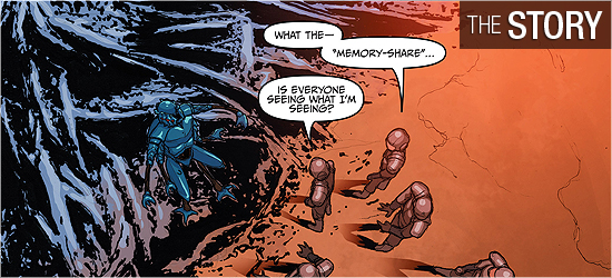
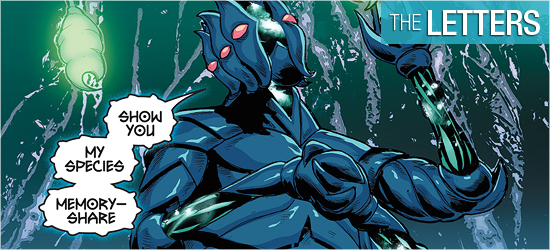
The away team mission was very cool — I’m always glad when the crew gets to board ships or explore strange new worlds. Having the crew wear their environmental suits was an added bonus to make the setting more alien. The character that communicates its origin to the crew was very cool, and he/she/it foreshadows the inevitable on Pages 20 and 21.
The cliffhanger on the final page starts a countdown clock that will speed up for next issue.
I’ve been a fan of Cat Stagg’s art and prints for some time, and learning that she was going to illustrate a Trek story got me excited. Her character work here is okay, with the figures looking very photo referenced (which is fine), and her work on the environmental suits is great. Seeing those suits in action makes me want to see them incorporated into every issue.
The character that first appears on page 12 was humanoid enough, but harkens to Yarnek from “The Savage Curtain” crossed with something from H.P. Lovecraft. Excellent design and his emotions are easy to discern from his/her/its body language.
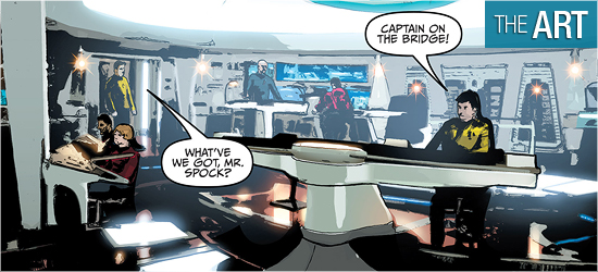
The backgrounds on this book, however, baffled and angered me. This is the third Star Trek comic storyline where photographs are used for the backgrounds, and it’s painfully obvious for the bridge of the Enterprise. The first panel on Page 6 looks awful.
This is not the quality of work I’ve seen before from Staggs and it’s devastatingly disappointing. When the new environment is first shown on Page 10, it’s impossible not to mistake it for a photo. In fact, on Page 11’s second panel Kirk’s left foot is floating above the ground because it does not match the background. When the flashback occurs, the setting improves considerably because it was drawn and not photocopied.
The double-paged spread of 20 and 21, however, is fantastic — the size and the design is what Star Trek should encounter. It’s both beautiful and frightening. However, it’s not enough to salvage the damage done by the backgrounds.
When Wes Hartman colors nebulae or blank backgrounds it’s quite beautiful. The first five pages, especially Pages 4 and 5, have colors that suggest the peacefulness of space. The bottom of page 6 captures the alien-ness of the ship and the space around it. The double-page splash on 20 and 21 is spectacularly colored.
The bridge of the Enterprise is an entirely different experience. Page 7 has smears of color for backgrounds, and it gets even worse on Page 8. I’ve seen Hartman’s work before and he’s better than this. Either the art from Staggs was so poor, which I don’t believe, or smearing the colors for the backgrounds was the only way he could think to disguise the photography.
Things don’t improve when the new character is encountered, but they do improve tremendously in the flashback. Those pages demonstrate the expertise I know Hartman to have. He outdoes himself on 20 and 21, but things become poor again on Page 22.
There’s no slighting Neil Uyetake’s work on this book with his dialogue and narration (same font), the undecipherable font of the alien — nicely done, and the alien’s speech when he speaks English.
I’m a huge fan of aliens’ speech looking different from the protagonists’ and Uyetake excels here.