Our Trek Comics editor Patrick Hayes is back with a review of this month’s issue of IDW Publishing’s Star Trek comic series: the final chapter of “The Tholian Webs,” the next adventure in the new Five Year Mission.
Order Star Trek #47:
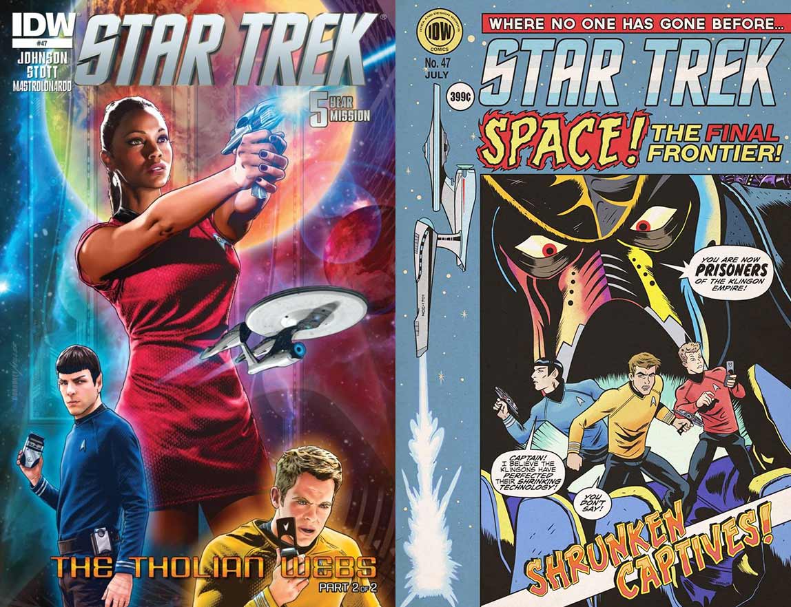
A twosome of covers to catch in your web this month.
- The first is by Joe Corroney and Brian Miller, which features a fantastic look at Uhura firing off a phaser blast to the right. The look on her face says she’s not sure about what she’s doing, but she’s firing nonetheless. Spock is on the bottom left displaying a bit of uncharacteristic anger as if something he’s heard has struck a chord. On the bottom right is an equally upset Kirk hearing some bad news over his communicator. The Enterprise is also on this image, speeding from the center to the right. Everything is set atop the traditional computer overlays that Corroney has been using for these covers, but there’s also an incredible desert planet behind Uhura which really makes her stand out. The illustration is good and the coloring is brilliantly bright.
- The subscription cover is something IDW is doing with most of their books this month: EC Comics-inspired covers. This cover is created by Derek Charm and strikes the balance between 50’s comics and Trek adventure. The title has Star Trek in its traditional font but below it is “Space! The Final Frontier!” The first word is on fire and the final has been colored in bold orange. The illustration has Spock, Kirk, and Chekov miniaturized on a surface that’s held by a Klingon, hidden beneath his helmet, who states, “You are now prisoners of the Klingon Empire!” The image is gloriously high in the cheese factor but harkens back to 1950s science fiction. The left side of the cover has the Enterprise in profile going vertically up to the price and issue number. The pale blue used for the majority of the image ages this cover well. The content of this piece has nothing to do with this issue’s story, but it’s fun.
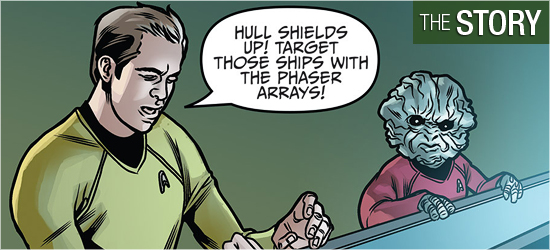
The conclusion to Mike Johnson’s “The Tholian Webs” begins with Kirk and Spock locked out of the bridge. A mad Sulu has taken control of the ship, McCoy has rendered himself unconscious, Scotty has separated the saucer section from the hull, and crew members are fighting each other. Oh, and some unknown ships are weaving an energy web around both portions of the ship.
Spock thinks he can finish the work the doctor began in synthesizing a cure to the interphase madness that’s sweeping the ship. Kirk leaves him to complete it as he rushes to a jefferies tube to get to the bridge. However, someone makes it to the bridge before him, changing what Kirk has to do. Meanwhile, someone in engineering fights Scotty for control of that section.
Fans of the original “Tholian Web” episode, written by Judy Burns and Chet Richards, will think they know how these problems will be solved, but Johnson has made a few changes to keep them on their toes. I like how two crewmembers that haven’t received much time in this series share the spotlight with Kirk. Fun moments include the entrance on Page 5, the slow fall on 7 (which is impossible not to hear in the actor’s voice), the profanity and the smile on 18, and all of Page 20.
I was impressed with Johnson’s ability to have one character be a large chunk of this story and have that individual remain true to their dialogue, as Page 20 demonstrates.
I cannot get enough of Rachel Stott’s work on this book. I hope that IDW continues to use her for Star Trek stories because what she’s bringing to this book is terrific.
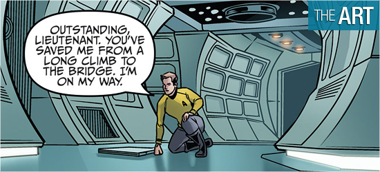
A good artist can tell a story without text and right out of the gate it’s apparent that Stott can do this: Kirk is frustratedly leaning onto a door, Sulu sits in the captain’s chair with a fallen crewman before him, McCoy lies in sickbay, and two members of the crew are exchanging punches. The three smaller pictures explain Kirk’s frustration in his pose. This might seem like basic storytelling, but try looking at any other comic to see how difficult this is.
The ships on this book are spectacular. The Enterprise, in both pieces, is the best it’s looked without looking like an enhanced photograph. Pages 2, 3, 14 – 17, and 19 have the finest ship in the fleet looking its best. The Tholian ships are very different from their television counterparts and they look great. They’ve got a lot more visible tech on them and they’re not obviously not Xerox copies of the same ship.
The interiors on the Enterprise are the best I’ve seen in a while because they’re drawn and not blurry photographs. Pages 12 and 13 are like visual treats because the backgrounds can be clearly seen!
Stott’s character work is also impressive. I’m sure that she looks at photos when trying to capture a character’s likeness, but her work doesn’t look as though it was traced. She is outstanding in making her illustrations look like the familiar faces from the big screen and she is able to have them emote in ways I’ve not seen them do in either of their outings. For example, Scotty looks fantastic in his fight in engineering. His emotion is spot on for what’s occurring and Page 7 has him do some physical work that is perfect, especially in the second panel.
I love Stott’s work.
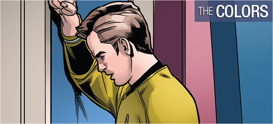
The Enterprise hasn’t exactly been a strong example of color variations since it was launched in 2009. It’s a white ship with silver interiors, with a bridge that’s so white it creates lens flares. The only things that typically light it up are said flares or the flesh and clothes of its crew.
Colorist Davide Mastrolonardo rightly makes the artistic decision to play more with the settings than those responsible for the films. There’s much more rust-red used to break up the monotony of the ship’s interiors for doorways and borders. Engineering gets the biggest changes, with a green-grey used for backgrounds, while the foreground retains its polished metal look.
The energy used for the antagonists’ webs has a strong white-yellow to have it stand out from the stars in the background, and the Enterprise gets some slick blues for an effect it must pull off. Explosions in space get a good orange, as does the phaser fire that starts the blasts.
My favorite coloring in the book would have to be the deep reds used for the Tholian’s speech. They made these aliens hotter than their actual appearance.
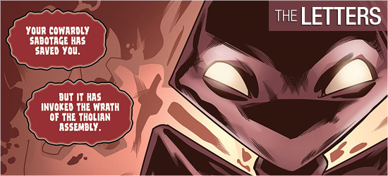
Robbie Robbins creates dialogue, ship transmissions, and narration (all three being the same font), sounds, Tholian speak, and concluding “End.”
I prefer lettering that uses different fonts for dialogue, transmissions, and narration, since they’re different forms of communication. The way they’re differentiated in this issue is by the shape of their dialogue balloon and coloring. It works, but I’d rather they looked different. The Tholian dialogue is fantastic!
I want my aliens to have a font that makes them different from the regular humanoids and Robbins delivered it here.