Order Star Trek / Green Lantern #1
It’s been a bit of a busy summer, but this weekend our Trek Comics editor Patrick Hayes is back with a review of the first issue of IDW Publishing’s Star Trek crossover comic: Star Trek / Green Lantern: The Spectrum War.
You’re going to have to be going at Warp 8 to catch all 25 covers for this first issue. That’s right: 25 covers to test your will, and wallet — and your power as a collector.
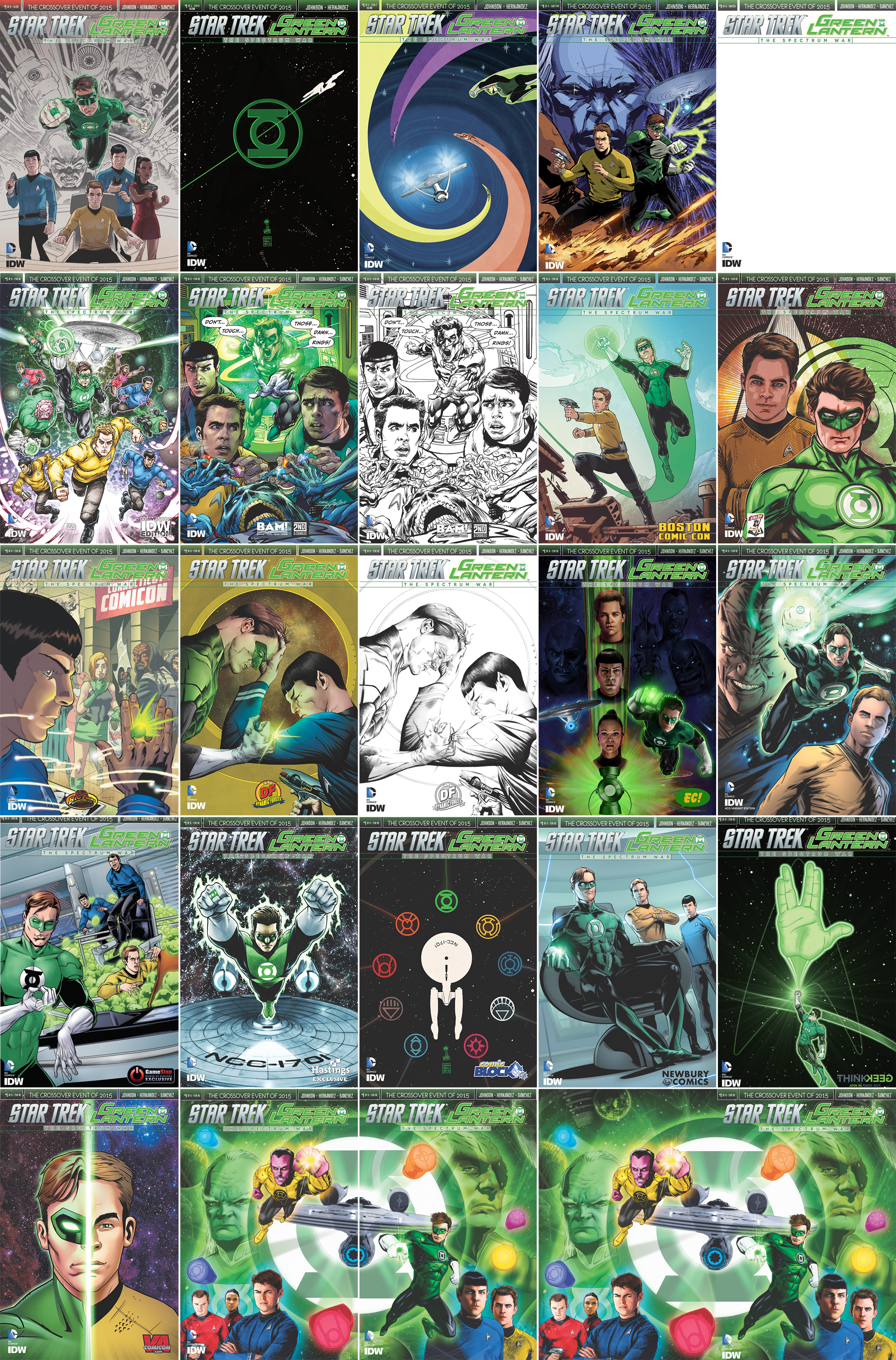
- The A cover is by Gabriel Rodriguez. This features Spock, Kirk, McCoy, and Uhura at the bottom of the image as if they’re on the bridge of the Enterprise. Above them is Hal Jordan as Green Lantern, flying forward, and behind him is a Guardian and General Chang, who is wearing the yellow ring of fear. There’s a good warp effect coming off the last two, colored in rose and pink. This is a decent image.
- The B is by Francesco Francavilla. On a fairly empty starfield, the Green Lantern logo sits dead center as the Enterprise in silhouette zips through it diagonally, bottom left to upper right. A very simple design that’s strong.
- Elsa Charretier is responsible for the C cover and it’s very colorful. In the bottom left the Enterprise is shown from the rear, as if it were escaping its pursuers. It’s being followed by four ring wielders, who leave solid colored streaks in their wake. There’s violet, orange, and yellow streaks — with the characters so far from the reader they can’t be made out, and in the top right is Hal Jordan beginning to leave a green trail. I like the lanterns in pursuit of the ship and the bright colors.
- The Subscription cover is illustrated by Garry Brown with colors by Doug Garbark. Kirk and Hal are standing side-by-side on a rocky world, though the ground appears to be on fire before them. The captain holds his phaser ready and the lantern has emerald energy coming out of his hand. Behind Kirk is an image of the Guardian, while behind Hal is the Enterprise. A good combination of characters but the coloring is muddled with a focus difficult to find.
- There’s a Sketch cover which is entirely blank, save the title at the top of the book and the companies’ names in the bottom left corner. This is ideal for taking to a convention to have one of the contributors sign or an artist to create an original illustration. Okay.
- Freddie Williams II does the San Diego Comic-Con cover and it’s got a lot of detail. Sulu, Kirk, and Spock are running forward at the bottom of the image and above them flies four lanterns and three crew members who are now wearing power rings. Behind all of them flies Starfleet’s flagship. The characters look sensational and the colors are perfect. This is one to track down!
- The first exclusive cover from Books-A-Million is illustrated by Neal Adams with colors by Paul Mounts. Kirk and McCoy are about to remove power rings from an alien’s fingers as Spock watches. They’re interrupted by Green Lantern who zips through a wall yelling, “Don’t…Touch…Those…Damn…Rings!” The officers look frozen in shock at the lantern’s appearance. This is Neal Adams, what is there not to like about this? Mounts colors are excellent.
- The second exclusive from Books-A-Million is the same as the previous cover, without Mounts’ contributions. This is a pencilled and inked cover by Adams and it, too, looks good. If you’re a fan of untouched art, this is for you. I like it better with the colors.
- The Boston Comic Con cover is by Gabriel Rodriguez, again. On an alien world with two moons in the sky, against a mountain range, Kirk is standing atop industrial equipment, his phaser aimed but not firing. Hal has just flown up next to him, his green trail in the sky visible, and his ring powered up. Nice, but nothing spectacular.
- Tony Shasteen does the Comic Book Legal Defense Fund cover with a photo-realistic Kirk slightly behind Hal Jordan. The Starfleet delta is behind Kirk, and the lantern logo is behind Hal. Strong images with beautiful coloring.
- Spock looks to have interrupted a human woman having a conversation with a Klingon after transporting into the Connecticut Comicon. It appears that at that same moment a green power ring has flown onto his finger, and he looks at the weapon in shock. Well, shock for a Vulcan. This exclusive to the Connecticut Comicon is drawn by Tim Seeley and colored by Mark Englert. There’s some good detail on it and the image is specific to this comicon, and that’s good. But it’s specific to that comicon, and since I didn’t attend I have no interest in obtaining this.
- The Dynamic Forces exclusive has a terrific image by Jae Lee of Hal and Spock fighting each other on their own terms. Hal’s got his power ring sparkling, showing he’s about to release its fury onto the Vulcan. Spock has his left hand on Hal’s forehead, as if he’s doing a forced mind meld on the hero, while his right hand holds a phaser to blast the lantern if he has to. Great idea for a cover that’s carried out exceptionally.
- The second Dynamic Forces is the exact same illustration minus the coloring. Again, like the Neal Adams cover, this is good for fans of an artist’s original art. However, I like this one, too, with the coloring.
- The third and final Dyanmic Forces is the same image, with the colors, but without any text. This is often referred to as the “virgin” cover by some publishers. This is just as spectacular as the first cover by Lee.
- Adam Riches does the Emerald City Comics exclusive and it’s really sharp. In the bottom center is a Lantern’s power battery. It’s emanating energy, shooting a strong stream upwards into a starfield. Within this energy blast is a totem pole of faces: Uhura, Spock, and Kirk. Hal is shown flying forward on the right, with the Enterprise flying forward on the left. Beautiful and cool.
- The Four Color Grails exclusive is by Angel Hernandez and Alejandro Sanchez. Kirk looks determined in a bust shot in the bottom right, Hal is flying forward in the center with a lot of power shooting out of his ring, and in the background, in the upper left, is Chang giving an evil smile. The coloring by Sanchez makes a focus difficult to find. This would have looked better without the colors.
- A humorous cover by Rachel Stott and Francesca Zambon on the exclusive cover for Gamestop. On the bridge of the Enterprise, Kirk and Spock are climbing on consoles to keep themselves above the sea of green tribbles that Kirk is up to chest in. Hal’s in the foreground smiling at his mischievous deed. Perfect art, perfect coloring, and it’s funny. This is the only cover out of all twenty-five that’s got a light tone. More please.
- Brent Peeples does the Hastings exclusive. Hal’s flying forward from the center with the Enterprise flying below him. It’s an expected cover, from the expected perspectives. It’s a little darker than I like, but it’s a decent frontpiece.
- Another cover is done by Francesco Francavilla. It’s another simple idea that looks fantastic. The Enterprise is in the center of the image, shown from the top. It’s surrounded by all nine logos of the power rings. The ship is pure white and the rings are colored in their given colors. It’s simple and it works, and it’s only available from Nerd Block.
- Newbury Comics has Angel Hernandez and Alejandro Sanchez and it’s much better than their cover for Four Color Grails. From an angle looking up, Hal is sitting in the captain’s chair and Kirk and Spock don’t look happy about it. The art is good and the colors excellent.
- This perfectly geeky cover is by John Midgley for Think Geek. Against a starfield, Hal flies upwards making an energy construct of a giant hand giving the iconic Vulcan greeting. This, like the Francavilla covers, is a seemingly simple idea and it completely works. The green stands out spectacularly against the black.
- The VA Comicon gets the cover by Brian Shearer which is cut in half vertically. Hal is on the left, looking forward, and Kirk is on the right in the same pose. A good idea for a cover with bright colors that make this look good.
- The final three covers are from Previews and I bought the first two because I’m a huge fan of this artist and colorist. All three are by Joe Corroney with colors by Brian Miller. It features the right side of the lantern logo with the right side of the Enterprise flying out of it, set on the right side of the cover. Sinestro is at the top center flying to the reader. A Guardian is on the far left, looking composed of green energy. In the bottom left are Scotty, Uhura, and McCoy. Red, purple, and blue power rings are also on the cover.
- The next cover is the right side of the image. The left side of the lantern logo and the Enterprise are on the left side of the image. Hal is the four o’clock position of the cover, balancing Sinestro on the previous piece. Chang is mirroring the Guardian’s position, also made of green energy. Spock and Kirk are in the bottom right corner. Orange, violet, and yellow power rings are on this cover. When placed side by side with the previous cover, it makes a larger image.
- The final cover (WHEW!) is a wraparound cover of the previous two, so rather than chase both down, a fan could buy this one and be satisfied.
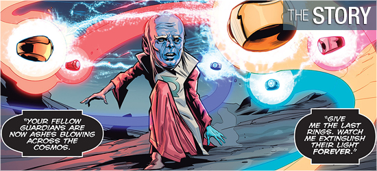
On the dead planet Mogo (which was a Green Lantern), Ganthet, the last living Guardian — the individuals who created the lantern power rings and oversaw them as force for peace — runs across its surface with six power rings flying behind him. He’s being spoken to by an unseen entity who tells him to surrender the rings so that they may be destroyed. All the lanterns are dead and all the other Guardians are “now ashes blowing across the cosmos.”
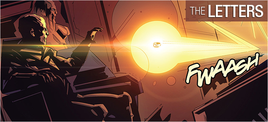
Defiantly, Ganthet says, “I am going somewhere you cannot follow. I go to preserve life in all its forms. That will be my victory.” As the unseen antagonist screams “Impossible!”, there’s a multi-colored flash of energy on the planet’s surface. “Another time. Another universe”, the Enterprise has come upon an orphan planet. Security officer Zahra, Spock, Uhura, and Kirk beam down to the planet and find someone’s remains and several pieces of jewelry.
This is a solid start up for this six issue series from Mike Johnson. The Enterprise crew do what one would expect, but things get complicated with the arrival of General Chang. I’m not going to count that as a spoiler since he’s on several of the variant covers. The justification for him to arrive at the moment makes perfect sense and I hope it’s not stepping on the toes of what might occur in the upcoming Trek film.
Pages 17 and 18 move the story into the DC hero’s universe, and I’m very interested to see what happens next issue in regards to this pair of pages. The final page is a solid introduction and a good cliffhanger. This final character’s dialogue is fully in line with his past appearances and I’m dying to see what happens next.
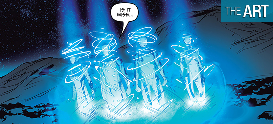
Artist Angel Hernandez does a good job on this issue. Things start very strongly with Ganthet on Mogo and the animated rings. When Ganthet is seen later he looks even better, though he’s changed considerably. The crew of the Enterprise looks solid.
Hernandez has done a good job in making the characters resemble the actors who play them, and not copied picture versions of them. Kirk and Spock get the most face time of the crew, but the rest get some decent scenes, with Page 18 being a highpoint for four of them.
I was really impressed with the away team suits on Pages 5 and 6. They’ve been streamlined quite a bit from how they’ve been in the films and there’s a cool distortion of the characters’ faces behind their masks.I really liked that little tweak. Chang also looks good, though he appears younger than his film counterpart in The Undiscovered Country.
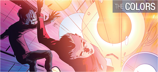
Energy becomes a key factor in the final third of this book. It’s here that Hernandez gets a little looser with his pencils, allowing the colors to dominate the visual. This is the correct choice to make because the colors would overwhelm the characters, so it follows that they should also overwhelm the reader.
Any book that features one, or more, lantern has got to have strong coloring. It’s a signal to readers who’s arriving from a distance and the intensity of each color shows the strength of each ring wielder. The book opens with the rings having soft pastel-like colors on the opening two pages. This rightly hints at their strength and their current level of weakness.
Aboard the Enterprise Alejandro Sanchez the expected cinematic silver and whites the franchise’s flagship now has, but he takes a few liberties in an small room in engineering. This is a much darker location and makes what’s going on down there much more sinister.
My favorite coloring of the book is on 18. I’m sure it wasn’t the most difficult page to color, but there are lots of variety on that page and it foreshadows where this story is heading.
Unseen villain speech, scene setting, dialogue, and captain’s log (these three are the same font), sounds, yells, and the “To be continued!” are brought to life by Neil Uyetake. I have to express some big disappointment here. Having the scene setting, dialogue, and captain’s log be the same font is somewhat shocking.
I’ve seen the last two be in the same font, but never the scene setting. The ring’s speech — yes, they talk — also should have a different font. These differences can be found in every issue from DC comics that feature a lantern. Additionally, the ship to ship transmissions are relying on the shape of the balloons to show the reader the difference in who’s speaking.
IDW dropped the ball in this contribution.