Our Trek Comics editor Patrick Hayes is back with a review of this month’s issue of IDW Publishing’s Star Trek comic series: the first chapter of “Live,” the next adventure in the new Five Year Mission.
As usual, this release is available in several different covers, four this time around!
Order Star Trek #50
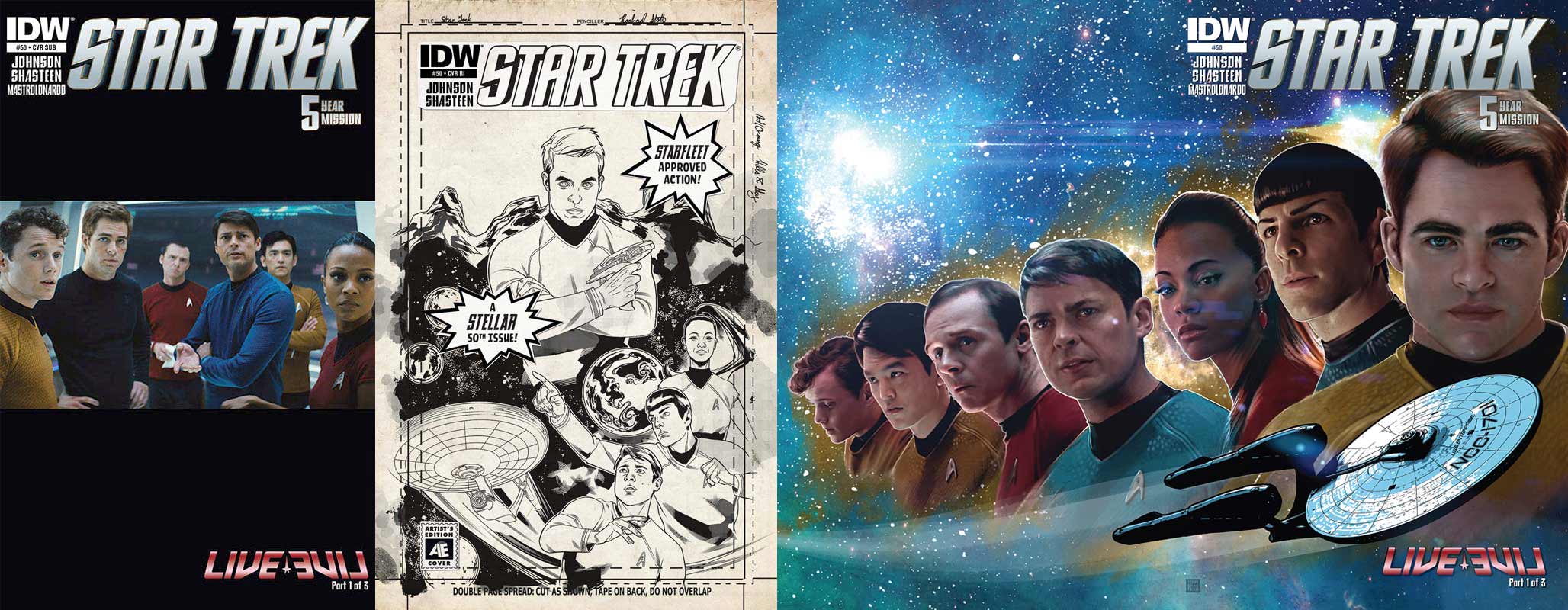
- The first cover is a spectacular wraparound cover by Tony Shasteen. The front features, from left to right, Uhura, Spock, and Kirk, while below them the Enterprise streaks by. Flipping to the back side, the cast is completed with, from left to right, Chekov, Sulu, Scotty, and McCoy. This is a great line up of the leads superimposed over a blue star field. This is poster/print quality.
- The second cover is the subscription photo cover featuring a scene from the 2009 film, with Chekov, Kirk, Scotty, McCoy, Sulu, and Uhura. This is a horizontal image on a vertically shaped cover, so there’s a lot of black space on this. Such a cover draws attention to the title and book and the title of the story, at the bottom, and it could be used to get autographs of some of the comic creators or cast members, if one were lucky. However, I’m not liking this much empty space on my covers. Going with a vertical image would have been better.
- Next up is the Artist’s Edition retailer incentive cover. This features artwork by Rachael Stott. This is a nice mock up of what a cover would look like in its original state, before it’s colored. Stott is one of the best artists to do Star Trek in the last year and this cover shows why. Her characters look terrific, with their poses being outstanding, and the composition is perfect: Kirk at the top, with Uhura, Spock, and McCoy below. The two text pieces on this cover are pretty funny. I love this.
- The final cover is the Artist’s Edition sketch cover. These types of covers have become very popular for fans to collect. One can purchase this cover and take it to a convention to get an artist to draw a character on it, or one could get the creators of this book to sign it. Either way, such a cover ends up being a one of a kind item that is instantly collectable. That said, it looks best when something is on it; on its own, in its blank state, it’s not that great.
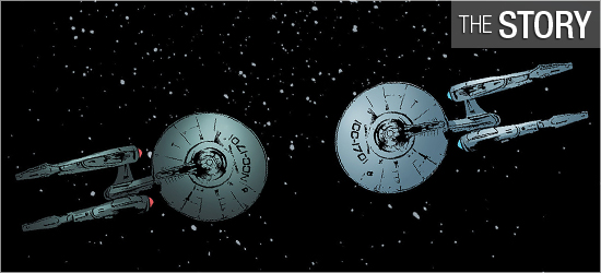
Kirk’s log opens the issue, as the captain states that everything had been going well for the Enterprise and her crew until they recently encountered an ion storm. As suddenly as it appeared, it disappears. Unfortunately the storm has shot the ship near the Ceti Alpha system, hundreds of light years off course. Kirk orders the ship to proceed to their previous coordinates before the storm began.
Before they are underway they receive a hail from Ceti Alpha V. On the screen appears a young woman stating, “Please, we surrender peacefully! There is no need to exact retribution upon us!” Naturally, the crew have to investigate and they encounter a surprising individual on this world on Page 9. The reactions of all from the Enterprise mirror exactly what the reader would have done.
This is the story that had to happen and writer Mike Johnson puts some neat spins on the classic “Mirror, Mirror” episode. The first of which is going to Ceti Alpha V. If anyone is remotely familiar with Star Trek, this planet will be a red alert as to whom the crew should encounter. Once this person appears it’s obvious that things are different, but the arrival of another ship throws focus to events in the orbit of this world.
The dialogue that begins on Page 14 is great; this group of characters is exactly as they should be — familiar, yet different. I especially liked the inclusion of the character in the last panel on that page. The incident that occurs on 17 might seem too much, but some quick dialogue justifies it, and shows a major difference between the ships. There’s also a nice bit of humor, granted sarcasm, that eases the violence.
The action returns to the surface of Ceti Alpha V for 19 and 20, and one of the familiar characters shows that he has some of the traits that the he is known for. I really liked the inclusion of “Terran” as a derogatory term, and the action that is taken by the character is right in line with his film counterpart. The final bit of dialogue from this person is stellar.
If the book had ended here, I would have been more than happy with the story, but the final two pages go elsewhere, bringing in two famous Trek characters, with the final page being a “Wow!” moment. This was enjoyable and I’m looking forward to the next two installments.
The visuals are by Tony Shasteen in this issue, and as with the previous issues he’s drawn, there a mix of both outstanding artistry and puzzling choices.
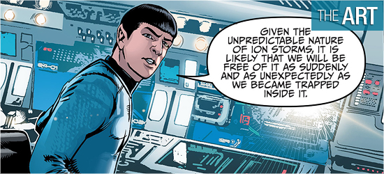
His character work is outstanding. Every character from the films look spot on: highlights include Kirk on Pages 2, 4, 5, 10, 19, and 20; Spock on 2, 4, 11, 15, 16, and 17; Uhura on 4, 16, and 17; Chekov on 18 (an outstanding change!); the character that first appears on 9, 19, and 20 (with that final panel being terrific); and the character that first appears on 5, 6, and 7; and the individual that has just one appearance on 21 (and this is a fantastic look for this character at this point in his life).
There are even a few aliens that make an appearance on 21 to convey a different location; and they, too, look great. The slow reveal that begins on 8 is a cinematic composition — it’s drawn out for the perfect “Wow!” reveal on 9.
Shasteen is also laying out his panels well, with Page 2 being a good example of this: there are five panels showing the stress the crew is enduring as they plow through the ion storm. Kirk is in the top panel, and the four smaller panels below him show three crew members’ responses, with Kirk reaching a conclusion in the final panel. All of these panels are set atop a background that shows the violence of the storm outside.
This is a good way to show the crew reacting to something outside, with the outside visible to readers, just underneath the characters. Very slick. The ship exteriors are also well done: when the Enterprise is buffeted by the storm, is released from it, or encountering another ship on a double-paged spread it looks good.
However, once again, it’s the panel backgrounds which give me the most concern. Focusing on the characters is difficult when the backgrounds behind them are so blurry/fuzzy. The first panel on Page 2 is an excellent drawing of Kirk in his chair. Both the character and his chair are crisp, clean, and clearly shown. The background behind him, whether drawn or photo inserted, is so blurry it distracts from the reading experience.
And taking a view of Spock’s panel at the bottom of the page; it’s the same — the character and his chair do not look as though they belong in the same environment as the background. Given the distance between Spock and the console, it’s logical to assume that the console should be as clearly defined as Spock’s station, but it’s not.
The bottom panel on Page 3 is even more unfocused. Page 4 provides a greater example by looking at panels three and four: panel three is a very clear background — the linework is thin and fine, with shapes in the stations and consoles absolutely clear, but in panel four it’s a blurry mess. I cannot understand the inconsistencies with the settings. The backgrounds of Ceti Alpha V are also blurry.
I’m again only liking half of the visuals.
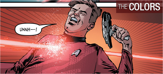
The opening page is a full splash by Shasteen and it looks strong, but the coloring of Davide Mastrolonardo really punches it up well, as a good colorist should.
The reds and blacks make this a powerful beginning to this story. Because the layout of Page 2 has the storm underneath the panels occurring aboard the Enterprise, Mastrolonardo gets to contrast the ship’s cool interiors with the harsh reds of the first page, reminding the readers of the Enterprise’s possible peril. Coloring is also nicely used for a transmission from Ceti Alpha V; this, too, reminds the reader of the actual distance between the characters speaking.
The coloring on the bridge on Page 14 was an excellent way to highlight for readers the change of locations, and it hearkened back to “Yesterday’s Enterprise” from Star Trek: TNG. The final page is also well done, with coloring used to suggest a coming out of the shadows, which is exactly what this character is doing.
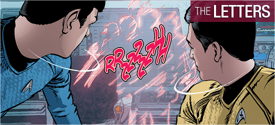
Neil Uyetake is responsible for the lettering on this issue, creating the captain’s log and dialogue (same font), and sounds, with the massive one on Page 19 being perfect.
I would have liked to have seen a different font for the log, dialogue, and the transmission, rather than the shape of the dialogue balloon on the transmission being the visual cue for readers, but what’s here is fine.
The first extra for this 50th issue celebration is Continuing Voyages In a Four-Color Frontier by Joseph F. Berenato, editor of New Life and New Civilizations: Exploring Star Trek Comics. It nicely summarizes how Star Trek has fared at various companies before ending up at IDW Publishing which has had the benefit of tying in with the film’s continuity. Mike Johnson is rightly praised as one of the longest Trek comic scribes, as are several artists for their contributions.
The 50 Top Alien Species!, with annotations by Johnson, follows as the second extra. This is an excellent listing of the species explored in the series’ run and the comments by Johnson are nice peek behind the curtain to see what the writer thinks of some of his, and others’, creations.
This is followed by Star Trek Comics: An Oral History, which is an interview between Sara Gaydos, the current editor of the Star Trek releases, writer Mike Johnson and former Trek comic editor Scott Dunbier. This is an excellent behind the scenes look at how the series was launched and what Dunbier and Johnson did in the early stages of the book, to be continued in next month’s issue.
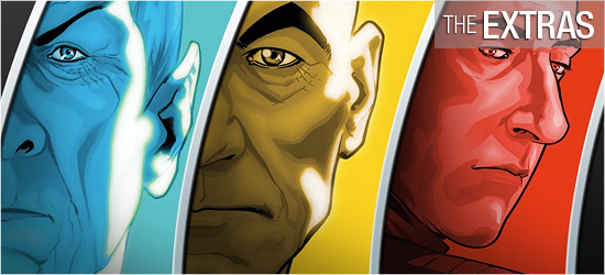
The final extra is The Stellar Artists of Star Trek in which Sara Gaydos conducted interviews with Tim Bradstreet, Rachael Stott, Stephen Molnar, and Tony Shasteen. This is also a nice piece as she asks the artists about their work on Trek and questions about the series and films. All of these were very enjoyable reads.