In brightest day, in blackest night… tur Trek Comics editor Patrick Hayes is here with his review of the next chapter of IDW Publishing’s Star Trek crossover comic: Star Trek / Green Lantern: The Spectrum War!
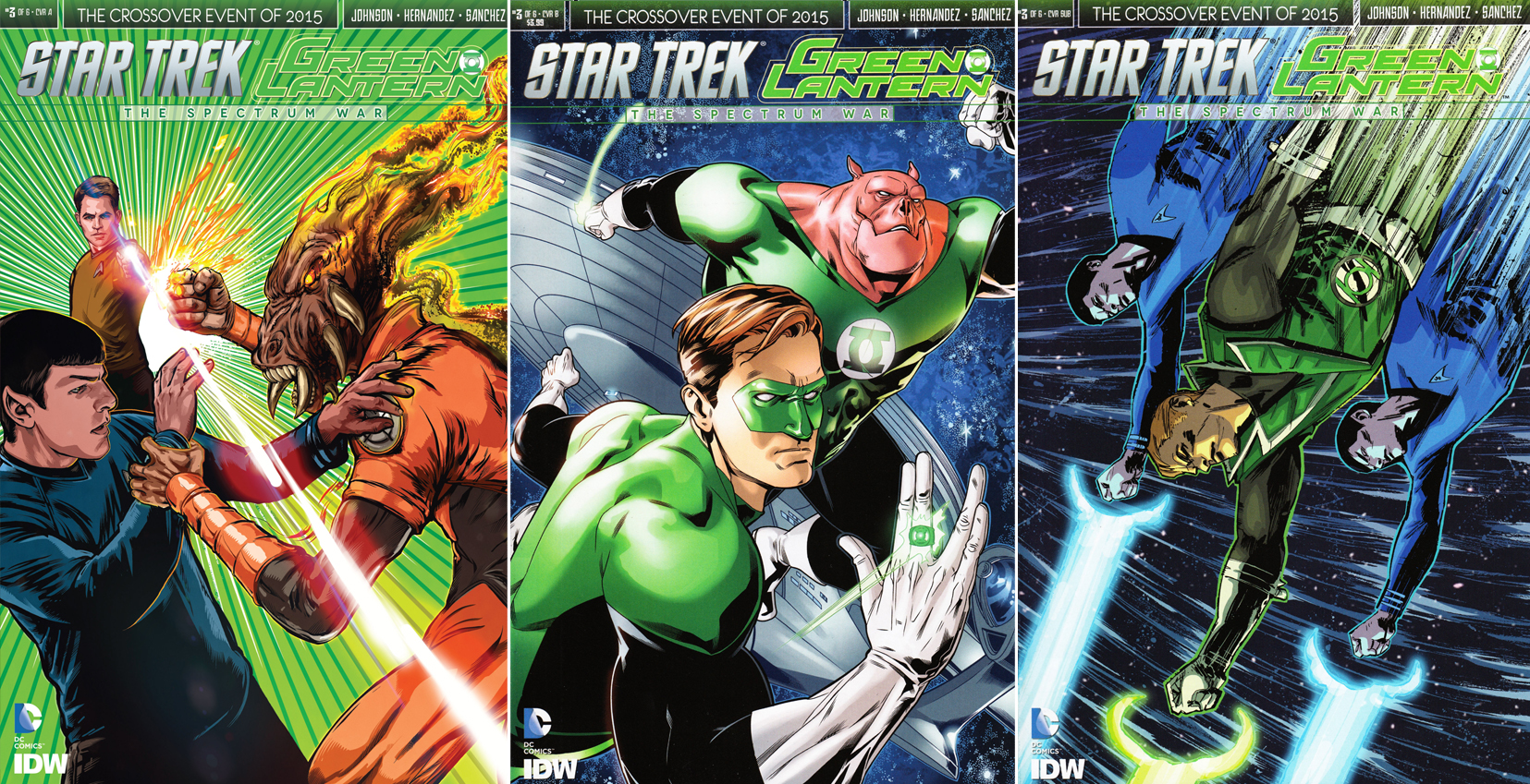
This third installment brings a trio of covers to add to your collection:
Order Star Trek / Green Lantern #3
- A trio to trek to your local store to add to your collection. Tony Shasteen has a vividly colored A cover that features Larfleeze about to pound on Spock. Kirk tries to defend his first officer with a phaser blast, but it doesn’t seem to be deterring the orange ring wielder.All the characters look good, with the film characters looking like the actors who portray them. Larfleeze also looks good. Some artists make him comical, but Shasteen nails the frightful face of this inhuman powerhouse. The greens are spectacular, making this cover a major eye catcher against paler comics.
- The B cover is by Rachel Stott (who did a sensational job on the Star Trek/Planet of the Apes mini-series) with colors by Davide Mastrolonardo. This is a terrific cover showing Hal Jordan and Kilowog flying in space with the Enterprise in close pursuit. This is a very slick way to mash up the franchises in space. The characters look excellent.Looking at the way Stott is drawing these DC characters, I’d love to see her get a crack at one of the monthly Lantern series. And take a gander at Hal’s gesture with his left hand!
- Garry Brown does the art and Doug Garbark the colors on the final cover, the C. This is a surprising image of three ring bearers, McCoy, Guy Gardner, and Spock, flying quickly through space, heads down, their rings blasting something below them. I did not expect to see Guy in any part of this series, so this was an nice surprise, and a very welcome one.I like the angular look of the art, but I do wish the colors had been a bit brighter; this comes off as too sedate.
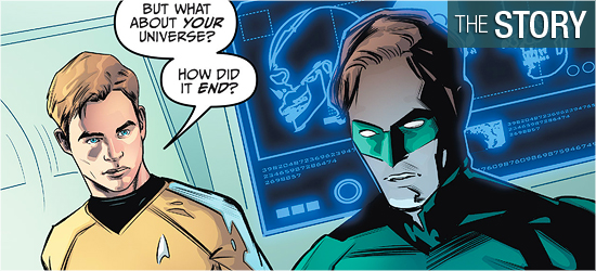
The first four pages of The Spectrum War: Issue 3, written by Mike Johnson, explains how the lanterns are in the Star Trek universe, and it’s very clever. Ganthet, the last Guardian, used an escape plan called “The Last Light.” He combined “the power of multiple power rings to create a rip in space-time and open a portal to a parallel universe.” Doing so cost the Guardian his life.
On the positive side, it pulled every surviving lantern with it, which is how Hal and the others are now in the Trek-verse. Kirk correctly asks what threat caused Ganthet to enact this protocol. Page 2 reveals it was Nekron, the Black Lantern, who is able to resurrect the dead — essentially as zombie lanterns. This is the second time Nekron fought all the lanterns, and he realized his advantage this time: “there will always be more dead he can raise than there are living to fight back.”
Nekron was on the verge of winning when Ganthet made his fatal decision. A quick discussion reveals what the colors represent and why some of the Enterprise’s crew wears rings, but Hal warns Kirk that some of the other ring wears are not going to be friendly.
The story then travels to three of these new ring wielders, all Star Trek characters, who have to realize that they are no match for the masters of each ring, who arrive on the scene. The character who seems most willing to speak with the leader of the red rings was a good surprise, what the new orange ring wearer does to his own people is shocking, and Sinestro continues to be one of the best written villains in comic book history.
After the villains get their pages, one member of the crew goes out and enjoys his ring, encountering a pair of famous lantern heroes. The issue ends with someone else about to punch their way into the Star Trek universe. No reader will have to think too long about who that is.
This issue justifies how these characters can meet, how the Star Trek ring wearing villains realize they’re part of a larger group, and the real threat is revealed. I liked the reasoning behind this series which follows the events of the 2009 – 2010 Green Lantern saga Blackest Night. If you’re a Star Trek fan, this may be too super hero heavy for you, and the scenes that are spent with Star Trek characters are overshadowed by the lanterns.
I’m a big Lantern fan, so this didn’t bother me a bit. I thought that this much time had to spent with the lanterns since they’re the ones that are now placed in the Star Trek realm. After this issue, I’m sure the next will have a more equal split, considering all will have to give up any animosity toward the others to survive the individual who threatens them all.
The visuals by Angel Hernandez are good. His character work is tip top.
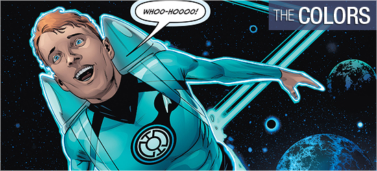
The Trek characters are close enough to the actors’ likenesses. The story doesn’t provide him with many opportunities for Kirk and his crew to do much beyond standing and listening to the information that Hal gives them. However, he does move his point of view around well enough to keep these scenes visually interesting. Chekov is the one character who gets to do something major with his ring. Granted, it’s only for one page but it says a lot about his character and it will have readers wishing they were him instantly.
The lanterns get the most face time in this issue. The double-paged spread of Pages 2 and 3 shows the various lanterns in battle with Nekron’s forces and it’s got a lot of bodies in action. I like what I see, but I wish the image was pulled in a little closer, because there’s a lot of dead space in the top center of this image, as if Hernandez didn’t know where the narration would be set or how much of it there would be.
Watching how the villainous Trek lanterns interact with the lantern masters was very good. I like how the leader of the reds went old school in his constructs to take out the Gorn, though I’m still not sold on this design of this reptile species. I’m an old codger on Gorn, and if doesn’t look like the costume Bobby Clark wore, I’m not going to be happy. Much better is the scene on Romulus. Excellent setting and outstanding actions. That was a highlight! On Kronos Sinestro is in charge and Hernandez has brilliantly captured his smug, superior attitude.
The indifference and then glee that splits his face with a smile is perfection.
With all the colors of the spectrum coming into heavy play in this installment, thanks to the focus on the lanterns, Alejandro Sanchez really has to sell the power of these characters. He does a good job of this on Pages 2 and 3. Each lantern leader has the familiar colored energy silhouette around him or her to be a tell-tale sign to readers as to who’s wearing a ring.
The strongest colors are yellow and blue on these pages. The greens are okay, and are the majority of colors on this page, but they come off flat. In fact, when energy is released from a lantern in the form of a power blast, Sanchez colors the energy white instead of green. It’s okay, but this doesn’t look right to Green Lantern fans.
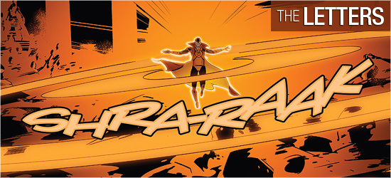
Later in the book, when the villains are spotlighted, the colors are much more dynamic. The reds really stand out against the brown Gorn world, the oranges are delicious on the Romulan homeworld, and the yellows are glorious on Kronos. The different shades of orange and yellow that appear on these pages are fantastic. Sanchez also got Sinestro’s red face perfect. Sometimes colorists make it too pinkish, but Sanchez has it absolutely right.
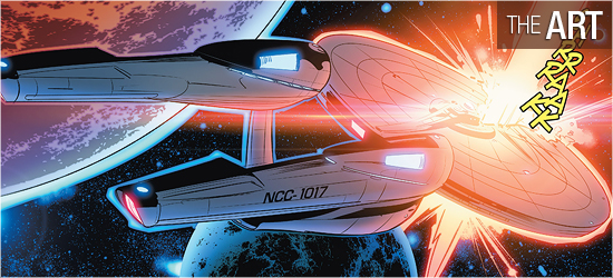
The interiors of the Enterprise should also get a shout out for Sanchez. Of late, the Enterprise’s interiors are colored glaringly white to ape the style of the ship’s rebooted look, or it’s got a faded quality to cover background insertions.
I’m not a fan of a pure white ship or bridge — I mean how much cleaning has to be done on this ship for fingerprints, smudges, etc.?, so I was relieved to see that Sanchez has colored it a pale blue. This gives the interiors a cool sci-fi feel and has a more active background for characters. A good choice!
Dialogue, narration, and scene settings (the same font), yells, sounds, and next issue’s tease are crafted by Neil Uyetake.
I don’t like having the first three elements all be the same font. Doing so creates confusion: a reader might assume that it’s all dialogue, for example. I’d rather there be a unique font for each. I would also have rather seen some of the alien dialogue written in a different font, such as the Gorn. This race has never sounded on the original series or Enterprise like a “normal” humanoid, so their should be a font to show this.
That said, the sounds are fun, with the final one that occurs outside on the Enterprise’s dish very cool.