In brightest day, in blackest night… it’s the fifth chapter of IDW Publishing’s Star Trek crossover comic: Star Trek / Green Lantern: The Spectrum War!

There are a trio of covers to collect for this penultimate issue in the series:
Order Star Trek / Green Lantern #5
- The ‘A’ Cover is by artist David Williams and colorist Charlie Kirchoff. Kirk is on the ground, Spock protects his captain with one hand and carries a phaser in the other, while Hal Jordan, aka Green Lantern, has created a green dome/shield to protect him and his friends from the swarming Vulcan Black Lanterns. This is a good layout, with the heroes looking good, but, being a Green Lantern fan, I’m a nitpicker for characters being shown wearing their rings, and these Vulcans are not. That’s my only nit for this illustration. The coloring is sharp, creating a dark and dire mood with the antagonists and a cool, eerie construct from Hal’s ring.
- Tess Fowler provides the illustration and Tamara Bonvillian the colors for the ‘B’ cover. This is the cover I purchased because it has the most amount of heroes on it (Kirk, Spock, Hal, and Uhura) and the greatest number of villains, including their leader Nekron. Granted, the resurrected Vulcans could be flying up to grab the protagonists, but I’m a sucker for a zombie cover and this throng does look a bunch of zombies, with the heroes trapped in on a tiny mound. I like the composition and the colors have the heroes nicely bright and the villains threateningly dim.
- The subscription cover has art by Garry Brown and colors by Doug Garbark. Hal is flying through space, leading the Enterprise though a group of orange colored ships. In fact, Hal has flown through one, destroying it. Green Lantern looks really strong and the ships flying behind him look great. The coloring brings strong focus to the character and allows the reader to then look at the fleet of ships being destroyed. Well done.
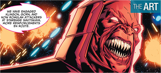
Starfleet Command is sending out a Priority One transmission on the ring wielders that have attacked Starbase Savitskaya and the loss of contact with the Enterprise. “All ships in all sectors maintain Red Alert until the threat is neutralized.”
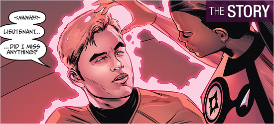
Sitting in the captain’s chair on board the Enterprise is Hal Jordan, who’s used the abilities of his ring to expand the size and power of the ship so that it can help the other ships battle the red, yellow, and orange lanterns. With the crew of the Enterprise on the bridge, thanks to a blast from Sinestro in the previous issue, Hal contacts Star Sapphire Uhura to return to the ship, whose ring is the opposite of Sinestro’s fear. She quickly awakens the crew who quickly go back into action.
This issue looked to be an all-out battle among the lanterns and the Starfleet officers, and it is, but writer Mike Johnson doesn’t make this just a slugfest. He throws in some good surprises, with the first being on Page 10 — I didn’t see that coming and it made my heart soar.
Naturally the biggest threat to anyone is Sinestro and Johnson has found a fantastic way to have him beaten. Just as it seems the heroes are on the cusp of winning, something unexpected occurs on Page 11 and it takes this saga in an all-new direction.
The comments by the antagonist on Page 13 are perfection — that’s exactly what that individual would say in this situation. The solution to the new threat revealed on 11 may have been shown on 16, which is followed up with some sweet dialogue by Scotty on 17. There’s so much to like about this story, with the big bad finally revealing himself on the final page and leading this story to its climax. This was really fun!
This issue has Angel Hernandez producing his best work.
The book begins with three heads shots of the lead ring wearers. The next two pages are a double-paged spread showing an absolutely spectacular scene of Starfleet ships doing battle with the ring wielders and their minions. Hernandez has magnificently captured the right amount of scale and chaos such an event would produce.
Inserted on the far right of Page 3 are two panels with Hal contacting Uhura, while showing the problems they’re dealing with. These pages are drawn so well that no dialogue would be necessary to understand what’s going on, but it sure makes the visuals a lot more dramatic!
Hernandez does a really good job with the energy rippling around each ring slinger, such as on Pages 4 and 5. The space battle is fantastic throughout. I’d love to see Hernandez get his pencils onto a Green Lantern monthly book to bring this level of epicness to it.
The character work is also really strong, with Spock, Kirk, Hal, and Sinestro being stand outs. He illustrates the latter often from an angle with his head slightly dipped down, making his evil features all the more pointed. The smile that’s on Sinestro’s face is wonderful.
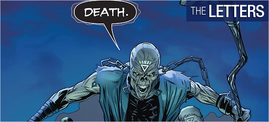
In addition to the two leads on the Enterprise, the crew is equally well done, with one character getting an amazing addition on Page 16 making this individual just awesome. The final panel features the arrival of the book’s big bad, and he and his minions are shown just appearing over a rocky hill and they look great.
This is the perfect way to end the book: revealing the bads and showing them just about to engage the heroes.
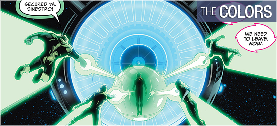
With all the energy being tossed about in space, there are several opportunities for Alejandro Sanchez to show his talents, and boy does he!
The first page has brief glimpses of the power being used, shown just behind the two villains, but Pages 2 and 3 explode with power in every luminescent shade available: greens, yellows, blues, oranges, and pinks.
It truly is a spectacular showing, and Sanchez is able to maintain the intensity of the colors throughout — making the colors tell the reader the story before he or she has read the panel’s text. Even the interiors stand out strongly, with some impressive work in blue, such as on Page 11.
He also does a slick job on dulling one character’s colors on 13. The color scheme on 16 was a good choice, foreshadowing what that character may be capable of to long term GL readers.
Broadcasts, dialogue, and a character’s specific dialogue on the final two pages constitutes Neil Uyetake’s contributions to this book.
I’m glad to see that the final character’s dialogue was differentiated from other’s speech, as that’s how it was done at DC Comics, but that transmission that was in the opening two pages should be a different font from the dialogue.
I would rather see a different font than the shape of the dialogue balloon be different.