Suit up, cadets! We warp back to San Francisco in the first chapter of IDW Publishing’s Starfleet Academy comic miniseries!
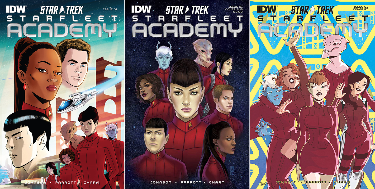
There are a trio of covers to collect for the first issue in the series:
Order Starfleet Academy #1:
- The regular cover is by interior artist Derek Charm and it’s the right way to introduce this series, and cast, to readers. Against the iconic backdrop of the Golden Gate Bridge, which is always shown whenever Trek goes to the Academy, giant head shots of Kirk, Uhura, and Spock are shown. In the bottom right is the cast of this series. Going from left to right are new characters Grace Chen, Lucia Gonzalez, Vel K’Bentayr, T’laan, and Shev. Zipping through the bridge is the yet unnamed ship that this new cast will fly. This has familiar elements so fans know whom they’ll encounter, an introduction to the new team, and the ship the team will fly. Everything that should be shown has been included by Charm and the coloring is is spot on. Grade: A.
- Jen Bartel is responsible for the subscription cover showing bust shots of the all the characters against a starfield. T’laan is in the middle, as she is to be the leader of this new team, while around her, going clockwise, are Vel, Grace, Kirk, Uhura, Spock, Lucia, and Shev. This is a much more realistic style than the regular cover and much more dramatic, relying on only the characters’ busts. Bartel has nicely captured the emotions one would associate with the classic crew (Kirk has got a twinkle in his eye, Uhura looks concerned, and Spock fascinated by something), while the new crew looks impassive, save Lucia who has a warm smile on her face. Grade: A.
- The retailer incentive cover by Else Charretier is the most cartoonish of the three, but it’s the one I like the most because it’s got so much personality. Against a pale blue background filled with the yellow logo of Starfleet Academy, the new characters are walking forward. In the lead is T’laan, rigid and not pleased with what’s occurring behind her. To her right is Lucia who appears to be waving excitedly to a distant friend, with one of her arms hooked around Shev, who looks uncomfortable at the human’s actions. To T’laan’s left is Grace, who’s also waving, though not as spastically. Just behind her is tall Vel, smiling up at the person Lucia is gesturing to. This is the cover for me, with its great characters and excellent colors. Grade: A+.
It’s 2258, and Spock and Uhura are having a dinner date, which ends badly. Uhura’s mood is broken by an pink alien walking by screaming into a communicator: “Selia, you were right. He’s just a lying, misogynistic narcissist with dreamy blue eyes. From now on — I’m done with humans.” She followed by a pleading Jim Kirk, who spots his future communications officer, and with a smile, sits down with her.
This beginning with the future Enterprise crew is done to introduce the plot thread of Uhura hearing something sparking her curiosity. This fixation on a signal has her drawing on the resources of another familiar character, which has some pretty humorous moments.
Written by Mike Johnson and Ryan Parrott, this tale gives readers a taste of what their favorite team was up to while at the Academy, while focusing on T’laan and the other crew members coming together in the present, 2261. I like T’laan’s motivation for leading her team, and Page 14 just dripped with acid. Her response to a future team member on 15 is wonderfully Vulcan.
Lucia is going to be the emotional one of the group, and not just because she’s human. She’s always got a smile on her face and she really enjoys teasing the others. Grace Chen, the other human, is very reserved in this issue and that may be due to one physical aspect of hers being immediately mentioned. Without spoiling anything, she reminds me of the title character from a certain Star Trek: Deep Space Nine episode.
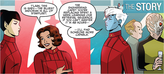
Matching emotionless T’laan is Andorian Shev, who shows some teeth on 16. The final member of the group is Vel, who is a Kelvin. This character only speaks twice, with the last being in stilted speech.
Given the other four characters, it was natural to have Vel speak differently from the others, and I’m hopeful that this slight awkwardness with Federation Standard changes as the series progresses. This eclectic team holds a lot of promise. Grade: A.
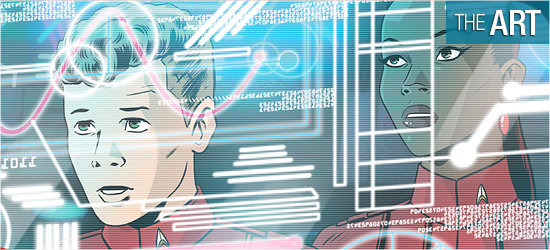
Derek Charm’s style really won me over. The characters look as though they’ve been taken from an unproduced animated series. Charm easily captures the likenesses of the film’s characters, drawing them successfully from a variety of angles. This is apparent on the first two pages as Spock and Uhura are sitting down for the majority of the panels.
This must be an artist’s nightmare, since this is a “talking heads” sequence, yet Charm captures Uhura’s human emotions well, as well as implying Spock’s with a close-up and the final panel on 2. Kirk’s swagger is infectious when he appears. However, these classic characters can’t hold a candle to the individual who first appears on 11, whose smile radiates warmth and steals the issue with a look at the end of 12.
The new characters are also wonderfully drawn: T’laan is the unmovable Vulcan, who teases an emotional response even when silent (Page 10), Lucia, the happy human, Grace, the reserved human with the outstanding “additions”, Shev the stoic, and the massive Vel. I’m looking forward to seeing all of these characters in action, especially Shev and Lev who look to be strong.
The other new character is Professor Trumble. I won’t spoil what race he is, but it’s a familiar species that has been seen in two Trek series. This character was an utter delight to look at. The height of the character gives this individual a cuteness factor, but, being familiar with the species, I’m awaiting a visual meltdown at some point. There are several non-speaking background characters that populate this book, as expected by its location, and every one of them is interesting to look at. Some have been seen elsewhere and some are new; all look amazing.
There is no stated colorist in the credits, so I’m assuming that Charm is also the colorist. Being set at the Academy, I expected the color scheme to be passive for this book, befitting a location of study. Luckily, the book begins at a restaurant, so Charm gets to have a dark exterior to highlight his characters. Lighting the buildings in a similar neon white-blue fashion (which had me defaulting to Tron), even Spock is dark clothes popped out.
The whites on Cadet Kirk had him stand out for his entrance, and also allowed Uhura to be focused upon with her off-white dress. Blues are excellently employed for computer displays, which bathed a room entirely in their glow.
The best use of color occurs on 17 which features outstanding use of several colors that make the art even more soothing to look at. Though I have to admit the greens on the final page got my attention. Grade: A+.
Scene settings and dialogue (same font), a transmission, date designations, the name of a team and a computer title (the same font), Vel’s dialogue, and a sound are created by Neil Uyetake.
He uses a clean font easily read, though I wish that the scene settings and dialogue employed a different font as they might be misconstrued for narration. Grade: B+.