It’s this month’s issue of IDW Publishing’s Star Trek comic series: the first installment of “Legacy of Spock,” the next adventure in the new Five Year Mission.
You can’t go wrong with either cover this month.
Order Star Trek #55:
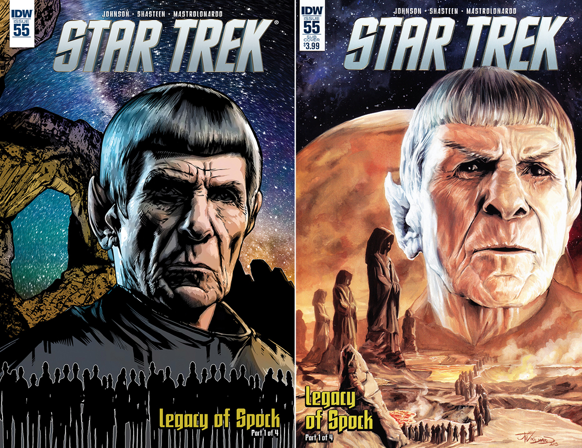
Legacy of Spock, Part 1
- The regular cover is by the book’s interior artist Tony Shasteen. This is a spectacular image of Spock, as seen in the last two films, against a rocky background at night with a gorgeous starry sky behind him. Before the bust shot of this iconic character are the elongated silhouettes of a mob of Vulcans. The slight stretching of these characters makes them look even more alien. Well done.
- The subscription cover is by J.K. Woodward and it too is just wonderful. This is also a bust shot of Spock, though on this piece he’s surrounded by the familiar scenery of long gone Vulcan: giant statues, lava pools, and a cloaked procession. He appears to be confused at what he’s witnessing. Readers won’t be confused by the greatness they’re seeing in this image.
The introductory chapter of the Legacy of Spock storyline by Mike Johnson begins just before the ending of the 2009 film.
Spock is looking upon the Golden Gate Bridge, realizing how its structure reminds him of another place. He walks back to Starfleet Headquarters while he reminisces on his past before encountering a familiar face from one of the best scenes in the film. He soon leaves the surface of Earth and passes by a vessel that creates one final memory, which transitions to a smile inducing conversation.
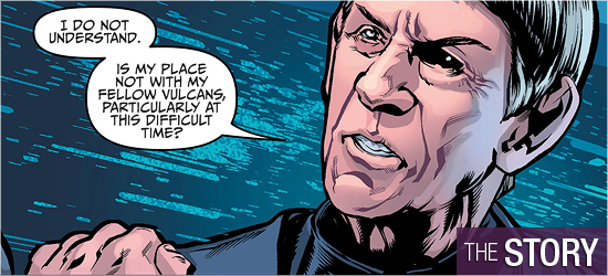
Spock meets another fan favorite and that individual gives him some pointed advice that is as strong as any scene that featured Nimoy in the last two films. The advice concerns some possible opposition at an event that begins on Page 14. This gathering isn’t Spock’s only issue: a pair is introduced on page 8 that will undoubtedly pose problems, as will the pair that show up on the final two pages.
I’m not surprised by the threats on 14. Johnson deserves major praise for being logical with these villains and their motivations. Heck, this plot line should have been a movie. The final pair of baddies, I’m not too eager to see reappear. I thought they had all been dealt with. Still, I trust Johnson, so I’m willing to see where this is headed.
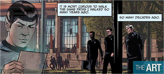
Artist Tony Shasteen turns in a perfect opening for Spock as he makes his way through some old haunts on Earth, from Starfleet Academy to the Golden Gate Bridge.
The first page has a solid cinematic introduction to the setting and the issue’s star. Page 2 is a great way to make a quick journey through this aged character’s past. Pages 3 and 4 match a scene from the film and Shasteen matches its emotional impact. The individuals shown on Pages 5 and 6 are always great to see Shasteen illustrate. The new characters on 8 and 20 are also strong, and it it was really fun to see the character on 15 Trekked up, since she’s quite the Dame.
The ships in this issue are also excellent, with two Starfleet designs looking as they should, and one new ship getting an updating from its last television appearance. Page 14 is a jaw dropping scene for the number of elegant vessels on one page. Settings are also better in this issue, with San Francisco and the vast interior of one ship on Page 15 very cool.
Occasionally blurry work does appear, such as in rocky structures on Page 1 and a corridor on 19, or in a building’s exterior in the first panel on Page 9. Still, these are the best visuals I’ve seen in a while.
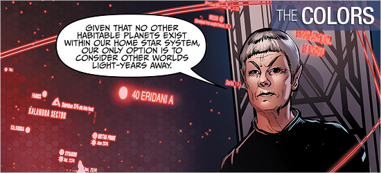
The color scheme of the reboots have always been woefully devoid of bright colors, taking some of the pizzazz out of the classic series. Thankfully, this issue provides Davide Mastrolonardo an opportunity to return to the splash of Technicolor. Before he gets to go there, he begins with a slick rust that creates memories for a character.
Faded colors mirror Spock’s recollections and transition smoothly to the interiors of the Enterprise. The colors used for 8 and 9 are also pale, but evoke a wonderfully sinister tone. These pages serve as a good lead-in to the colorful display on 14: this is the color scheme I’d like the films to mirror.
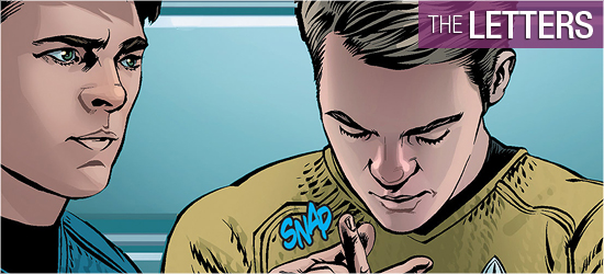
Three sounds on the penultimate page pack a nice punch in crimson.
Narration and dialogue (the same font), scene settings, and three sounds are created by Neil Uyetake. I’m a stickler for different fonts being used for narration and dialogue, as they’re different forms of communication. They would look better if they were visually different in form, rather than differentiated by the color and shape of their boxes.
There is a lot of narration and dialogue in this issue and Uyetake masterfully inserts it onto the page without covering key aspects of the art.
– Reviewed by Comics Editor Patrick Hayes