It’s the final issue of IDW Publishing’s first five-year run of Kelvin Timeline Star Trek comics, the concluding chapter of “Connection,” uniting the two Trek timelines to solve a crisis!
There’s two of comic covers to pick from this month:
Order Star Trek #60
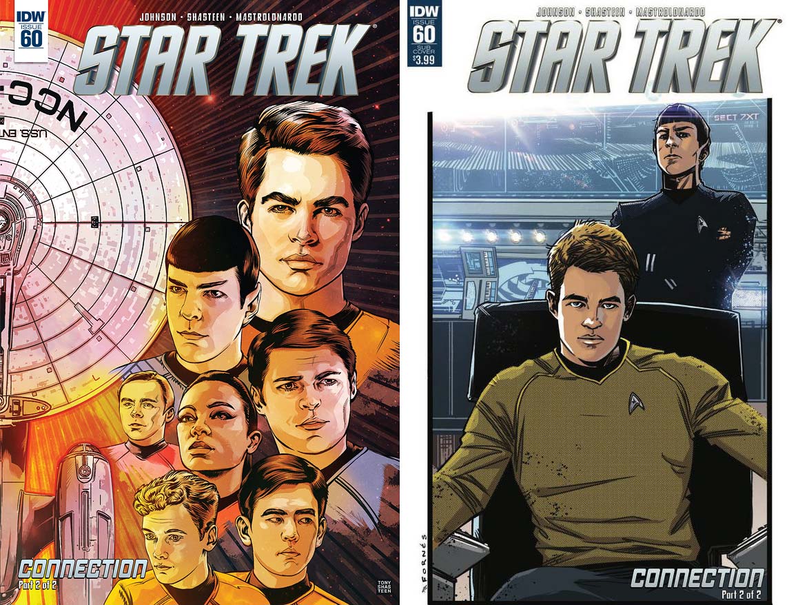
- The regular cover is by interior artist Tony Shasteen. It features the right half of the Enterprise flying up the left side of the image, flanked by the crew of the Kelvin Timeline cast. Starting at the top and going left to right are Kirk, Spock, Scotty, Uhura, McCoy, Chekov, and Sulu.The ship looks great and the crew looks even better. Shasteen makes this cover a true opposite by posing the characters in mirror positions to the classic characters of the previous issue. The color scheme also matches the previous regular cover. This looks good, but combined with the other makes this absolutely print worthy.
- The subscription cover is by Jorge Fornes, with colors by Mark Roberts. This has the reader looking at Kirk in his captain’s chair, while Spock stands behind him with his arms crossed. This visual captures the tone of the classic characters, but with the newer versions in their places.Kirk looks a bit better than Spock, simply because the Vulcan is being overwhelmed by the gleaming white of the bridge’s backgrounds, but it’s still nice. The backgrounds are also really clear, even with the lens flare effect; something that’s not been seen in this book’s interiors for some time.
The final chapter of Mike Johnson’s “Connection” continues in the same visual format as the previous installment: each page is cut horizontally, placing the original crew’s story at the top with the Kelvin crew at the bottom. Each story/timeline matches the other somewhat, with some slight differences.
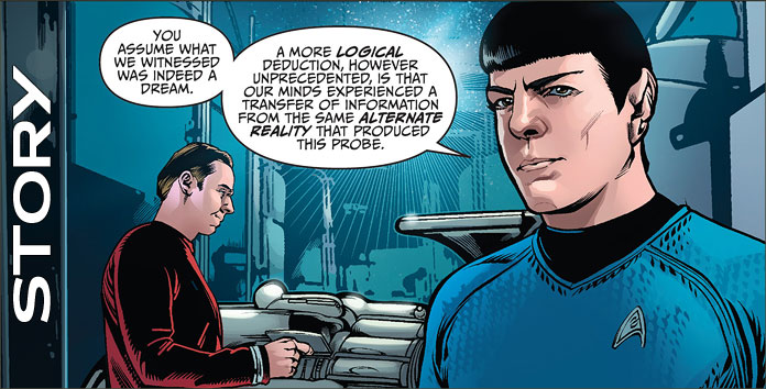
Both stories begin in the engine room. Kirk, Spock, and Scotty of each reality is examining a probe that has come from their opposite Enterprise. The Kelvin Scotty considers the probe before him as lovely, as if it’s a “lost prototype.” Both Spocks agree its appearance has something to do with the “visions” certain crew members have been experiencing. In fact, each believes it’s from an alternate reality.
At that moment the Scottys switch ships, as do the Spocks. Both McCoys don’t know what to make of the situation: each ship sees the switched men as the ones they’re used to seeing, though both men claim they’re not part of their crew. A call from the bridge demanding the captain has the action moving back to the seat of the action, and that’s when things are learned.
This is a decent closer for a two-parter, and a decent conclusion for this series. Both crews meet, in a sense, though it’s not the actual interaction or team-up that I was hoping for. The storytelling format is clever, and works very well, with Page 6 a very funny/cool moment for the captains.
The device that’s having the crews crossover is very simple: it works, but not a lot is really done with it except establish what it is and have the crew decide how to escape it. If one is vaguely familiar with Star Trek, the answer will come to one’s mind in seconds, and that’s exactly how it’s solved. A longer story would have allowed other crew members to experience their other selves, but things have to be wrapped up for a reboot.
As much as a longer story would have been more interesting, the conclusion is a fine one, and I heard Alexander Courage’s score looking upon the final page. If a Trek story can do that to a reader, it’s working.
As with all my reviews of Tony Shasteen’s work, I enjoy the characters and the exterior of ships, but the interiors of vessels disappoint. This is made evident by the first panel on the first page: Kirk and Spock look good, as does Scotty, who’s got most of his back to the reader, but the power conduits are a blurry mess.
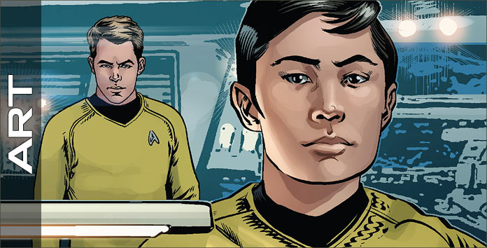
This has been Shasteen’s work since he’s been aboard IDW’s monthly Trek and it always creates a frustrating read. For example, look at Page 2: those characters are great, with Kirk and Spock in the bottom half gorgeously drawn. Turn a page and the excellent character work continues, now with the Simon Pegg Scotty getting the spotlight, but those backgrounds are like a smear.
The interiors of the Kelvin Enterprise fare the wost, with them becoming unbearable starting on 9. The original Enterprise is better, but there are moments when it too gets fuzzy. Shasteen does much better on 15 which shows the two Enterprises and several characters merging/splitting from their opposites.
As maddening as these visuals can be, when Shasteen hits it, he hits it out of the park, and 6 contains two images of the Kirks that captures the brash, roguish nature of both captains. They are perfect. If only every page were like these panels.
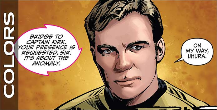
The colors of the Kelvin Trekkers look really good. David Mastrolonardo does an exceptional job in creating a good reflective effect in the characters’ uniforms, which always creates a strong sense of reality to the proceedings. The interiors of the that timeline’s Enterprise also nicely ape the sheen of the film’s setting.
As an Original Series fan, the interiors of the original Enterprise look the best to me with their dark and stark colors. Mastrolonardo also does a good job with computer screens on both ships, capturing the flavor of both series’ electronic screens. The best bit of the coloring, and the most varied, is on the penultimate page, capturing a nice sense of nostalgia with the bright colors, yet the darker colors on each Kirk suggesting they were going off into the sunset.
AndWorld Design provides the captains’ logs and dialogue (the same font), transmissions from the the bridge, an alien font, a sound, computer text, and the final three words for this issue. This is a dialogue driven work, so it should be no surprise that variations in the font design isn’t really necessary.
However, when it does appear, such as for the aliens or the computer text, it looks good. It would have been better had the logs and dialogue been a different font, as they’re even spoken in a different tone in both franchises, but what’s done is done.
What’s next for IDW’s Star Trek line?
While this may be the end of their Star Trek: Five Year Mission run of comics, IDW certainly isn’t finished with Trek – or with the Kelvin Timeline. IDW will be returning to the Prime Timeline in their new Waypoint miniseries starting in September, and resume telling post-Star Trek Beyond Kelvin Timeline stories with To Boldly Go #1 in October.
In addition, a sequel to the popular Star Trek / Green Lantern Kelvin crossover series has been slated to begin this coming January, and there is talk of a possible follow-up to this year’s Starfleet Academy series.
IDW’s team will be at the Mission: New York convention next weekend, and we’ll be watching for any additional announcements that may come out of their panel.