Order Waypoint #2
Star Trek: Waypoint #2 is a bit of a mix and match for this month’s offerings. Before I begin though, I have to say how much I love anthologies and how excited I am by the concept of Waypoint.
If there was ever a way to celebrate Trek, then an assortment of Trek stories is the way to go. As Gumpian logic goes, you never know what you’re going to get, but that does not mean you forever shy away from the box of chocolates.
First, I need to acknowledge that this comic issue was dedicated to the memory of long-time Star Trek fan Eric Cone, who passed away in September – adding a level of poignancy and fan appreciation to this book.
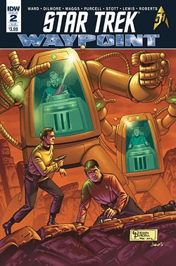
There are three covers to this book. The regular cover by David Malan is an admirable presentation of a typical “trinity” pose of Kirk, Spock and McCoy. It’s a typical cover and absolutely nothing wrong or unenjoyable with it. It’s solid, workable and exactly what a fan would expect to see.
The retailer incentive version is a standard photo shot of the same sort of idea except with a pairing of Kirk and Spock. It’s a fairly bland cover and I fail to see why this would be an incentive for a retailer to collect other than the limited amount of numbers of this book published. In terms of creativity, it’s a fairly bland incentive to comic shop owners. If it were me, I think I’d appreciate a more original comic art offering.
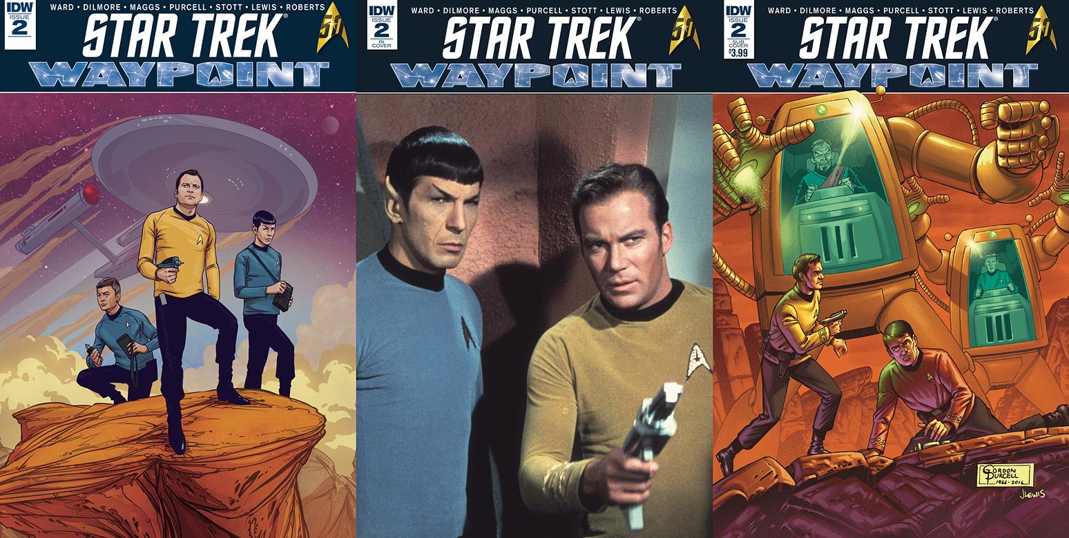
The subscription cover by Gordon Purcell has to be the winner out of the three covers for this issue. As I earlier indicated, this is a glorious reminder of those days long gone by when Star Trek comics were left to the imaginations of European artists with limited understanding and appreciation for the TV show. Still, there was a limited sort of imaginative originality to these books. It was a more generic type of science fiction that saw more continental rather than domestic artistic influence. Still, it was enjoyable and it did run from 1967 to 1978 so it saw a great deal of success. Clearly, something was done right.
The first story in Waypoint #2 is a class-A homage to the days of the 1960’s – 1970’s Gold Key Trek comics. If you were like me, and a devoted Star Trek adolescent, then you had at least one of these in your comic collection – and you probably complained about its woeful inaccuracies: the phasers needing ammunition, the Enterprise’s rocket exhaust fumes from the nacelles and the overall campiness of the series.
However, the truth of the matter is that the comic artists on this series were in the dark when it came to Star Trek, save for some publicity materials they were given. The writers were a bit more in the know, and some of these issues featured greats like Len Wein, so the stories worked. But there was an element of pulp to them that can be better and more fondly appreciated with age. I look back at them now with a smile and enjoy them for their simplicity and fun.
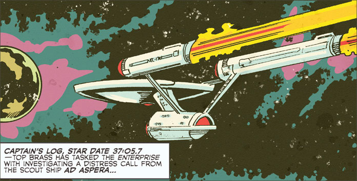
The Menace of the Mechanitrons is a wonderful tribute to this age; complete with awkward spelling rules, clunky dialogue and simplistic plot development. It’s a throw-back to a more basic era of comic creation but a thoroughly enjoyable one when you consider the amount of talent it takes to replicate that style.
Dayton Ward and Kevin Dilmore get full acclaim for their dutiful and reverential work in recreating not just the story-telling of this time but also the sense of nostalgia one gets when reading this book. It’s fun, and it’s definitely the same feeling I remember when I first turned the pages of a Gold Key comic many years ago standing next to a magazine rack in a bubble-gum scented grocery store waiting for my mother to finish the shopping!
Gordon Purcell gets a fully appreciative nod as well for so accurately capturing the same sense of positioning, layouts and action I remember from those days. It was a real treat and Purcell deserves a great deal of credit for his work.
However, the colouring also needs to be acknowledged in this story. Jason Lewis manages to provide a faded palette that also adds to the nostalgic mood of this story. It’s a real team effort in transporting the reader back to those simpler times. This is a story that can be appreciated by those of fine, discriminating tastes.
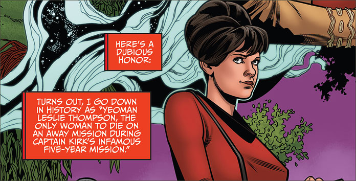
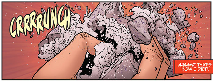
I had a more difficult time appreciating the second story – Legacy – written by Sam Maggs and penciled by Rachel Stott. It held the same promise, but fell down in its delivery. First off, it’s an admirable attempt by the writer to demonstrate her Trek-ness by identifying such an obscure piece of trivia and using it as the starter for the story. Yeoman Leslie Thompson was the only female redshirt to be killed on an away mission in the TOS canon, and I have to admire the cool factor behind that.
Yet, the story begins to lose its integrity with the awkward retrospective of alternate legacies Thompson could have had if she had somehow survived her encounter with the Andromedan visitors who killed her in “By Any Other Name.” The sequence of the story rested on the sequencing of various adventures of the Enterprise and how Thompson could have contributed to them.
I found the final panels somewhat confusing. Initially, I took this to be the Thompson from the Kelvin Timeline having survived her encounters – unlike her TOS Timeline counterpart. Yet upon more consideration, it was actually a future Kelvin Timeline cadet reflecting on Thompson’s memorial.
If Thompson was such a minor character and died a self-described pointless death, though, why would she be such an inspirational character? I confess to finding the sequence of that section of the plot somewhat vague and sadly, the story didn’t work for me.
However, Stott’s art was absolutely stunning. Her focus on the characters’ emotional expressions was a wonderful support to the story. Her clean lines and physical positioning of the made for excellent and dynamic panels and her work would definitely be something that I would welcome seeing again. There’s something to her art that is very reminiscent of Terry Dodson’s style: crisp, vibrant and completely realistic. It’s a thoroughly well-drawn story and definitely a style that fits Trek. It was well-appreciated.
Waypoint is still finding its legs in this second issue. It’s hard to go from zero to sixty but there’s an entire universe of Trek out there and lots of time and legions of fans eager to indulge their love of this franchise.