
Welcome, readers, to the first of many comic reviews here at TrekCore! Our new Trek Comics editor Patrick Hayes has joined the team to provide commentary and critiques of the ongoing graphic series based on the 2009 Star Trek film timeline, as well as the other Trek comic releases to be released over the coming months.
We begin our reviews with issue #4 of IDW Publishing’s Star Trek: Khan, the prequel series covering Khan Noonien Singh’s exploits between his reign as a genetic superman on 20th Century Earth, his escape to space on the Botany Bay, and the circumstances surrounding his Cumberbatchian appearance in Star Trek Into Darkness.
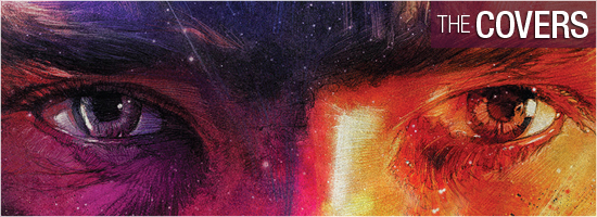
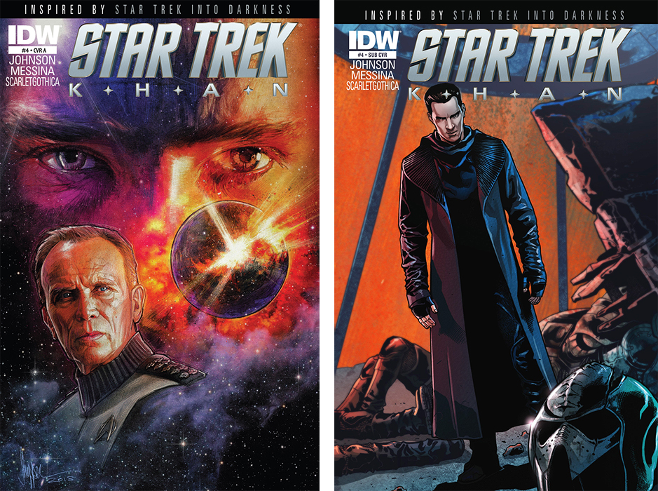
Khan #4 offers two cover choices to tempt your wallet, despite a surprising lack of a photo cover.
The regular cover artwork is by Paul Shipper, featuring a really nice shot of Peter Weller’s Admiral Marcus against an exploding planetoid — both beneath the watchful eyes of Khan. There’s some really nice coloring on this cover, and if you know anything about Star Trek, you should be able to make a pretty solid guess as to which planet is being destroyed. Grade: A.
The subscription cover is by interior artist David Messina and colorist Claudia ScarletGothica, showing a steely-eyed Khan viewing the bodies of defeated Klingon warriors on Qo’onos, as seen in Star Trek Into Darkness. I love Messina and ScarletGothica’s work, making this my favorite cover of the pair. Grade: A+.
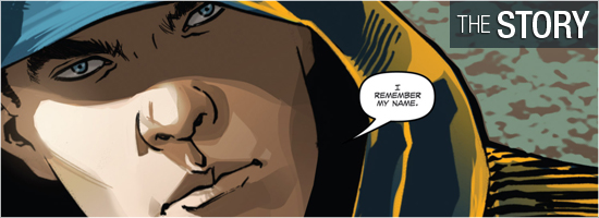
With the help of story consultant Roberto Orci, writer Mike Johnson takes this tale to the “present” era in the Trek timeline. When we last saw him, Khan was blasting into space aboard the Botany Bay; Khan #4 begins with the genetic superman waking up on a top-secret space station, and being addressed as “John Harrison” — he has no memory of his past. Admiral Marcus tells “Harrison” that he wasn’t just a soldier: “You were extraordinary… and soon you’re going to be extraordinary again.”
We then see Marcus and a very important aide — if you’ve been reading IDW’s monthly Star Trek series — and begin to get glimmers for what the Admiral has in mind for Khan. This issue illustrates the lie Khan is told to convince him to work for Section 31, and anyone who saw Into Darkness will know more about what’s going on then he does. The major source of tension in the story comes from waiting for Khan to realize the truth, and there’s a sequence beginning on Page 14 that I really was not expecting — why couldn’t have this been a part of Into Darkness?
This issue was an enjoyable read with a solid cliffhanger at the end, but it still doesn’t address the major question brought up earlier in the series: why doesn’t this Khan look like Ricardo Montalban? That’s the answer I want next month. Grade: A–.
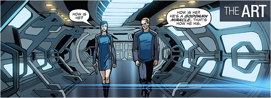
I am a huge fan of David Messina’s artwork, and was certainly not disappointed by this issue. He’s inked by Giorgia Sposito, and the pair did some amazing work on this book. As he’s done for IDW’s other Trek titles, Messina captures the characters’ likenesses quite well, especially with Benedict Cumberbatch’s Khan. While there are a few missteps involving Admiral Marcus, he still manages to capture Weller’s look most of the time.
I also enjoy the tech that he creates; the opening sequence in the medical bay has a tremendous window that just looks great, along with the station corridor on Page 5. The planetary setting on Pages 14 through 21 doesn’t have much detail, but I’m hoping that might be addressed in another film. The image in the final panel is just an oozing, ominous threat — and I dare you to read it without hearing Cumberbatch’s voice. Grade: A.
Khan’s flashback sequences were penciled and inked by Luca Lamberti.
Claudia ScarletGothica did a superior job with this issue’s colors. She knows exactly how to shade a character to make them look three-dimensional, and she really demonstrates her skill on Page 4 with the tiny close-ups of Khan and Marcus, the window just below the pair, and the bright holograms she brings to life on Pages 11 and 13.
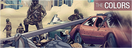
ScarletGothica changes up the coloring a bit on Pages 14 through 17, bringing a very natural look to a smoky environment not normally associated with typical “block” coloring seen in comic books. I love this colorist. Grade: A+.
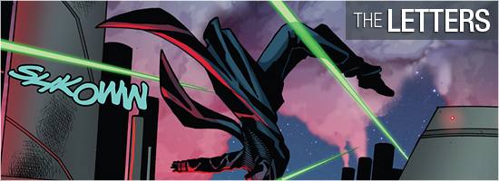
Neil Uyetake was responsible for the dialogue, scene-setting, and the four sound effects in Khan #4. I was hoping for some more consistency with the sounds — after all, that’s half the fun of a comic — but some noises are oddly mute. For example, there is only one sound effect for the three phaser blasts on the third panel of Page 16, and no sound accompanying the violence atop Page 17.
It’s a decent job, but I certainly wanted more. Grade: B+.
Bottom line: I’m still enjoying this series, but I’ve got serious questions that I sure hope are answered next month — and it’s certainly more enjoyable to read this Khan exploit than watching him on the big screen. Overall grade: Grade: A–.
![]()
 |
|||