Our Trek Comics editor Patrick Hayes is back with a review of this month’s issue of IDW Publishing’s new Star Trek crossover comic series: the first chapter of “The Primate Directive,” where the Enterprise crew finds the Planet of the Apes!
Order The Primate Directive #1
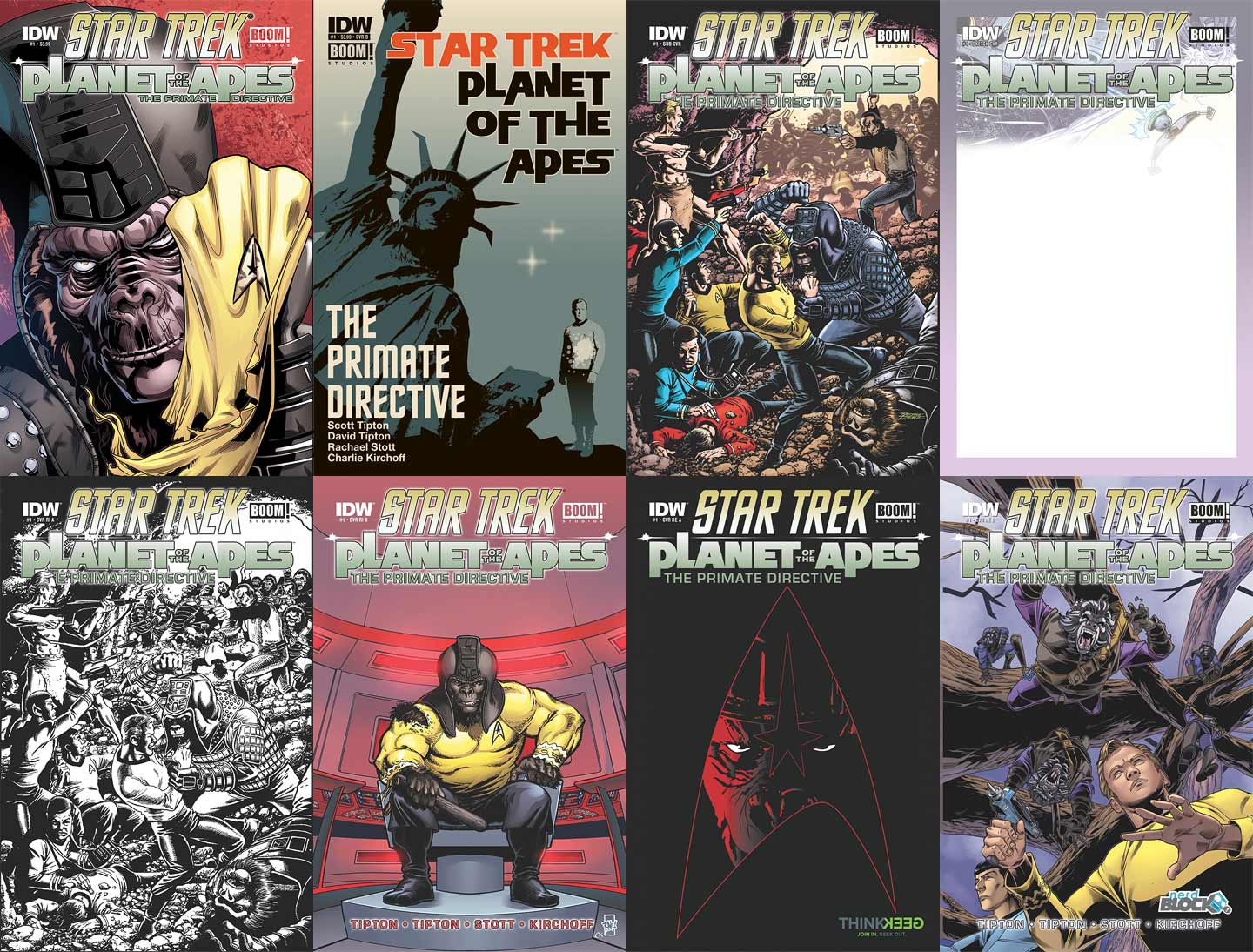
There are a whopping eight covers for you to hunt down! Good luck, humans!
- The A cover is illustrated by interior artist and colorist Rachael Stott and Charlie Kirchoff. It’s a close-up of General Marius smiling as he holds up a shredded Starfleet captain’s tunic. This image was used a lot in promoting this book and deservedly so. A simple idea executed perfectly to show these two franchises have collided. Excellent detail in his face and love the contrasting orange background with the captain’s yellows.
- Juan Ortiz, following up his excellent cover run on the recently completed Star Trek: Harlan Ellison’s The City on the Edge of Forever has created this cover featuring the classic image of the buried Statue of Liberty with a tiny Kirk beaming down before it. The lettering is set off by the grey, black, and white imagery. Excellent! I’m hoping that Ortiz does more covers for this series.
- The subscription cover has an absolute insane amount of detail from George Perez’s pencils and Len O’Grady’s coloring. The Enterprise crew and Charlton Heston’s Taylor are cornered in a cave by an army of Klingons and apes. Kor is aiming his phaser at Taylor who’s responding in kind with his rifle. Naturally Kirk is fighting hand-to-hand with Marius. Gorgeous art and coloring.
- Next up is the sketch cover. Rather than just the typical white space and title, this contains an image of the Enterprise firing upon a Klingon cruiser. I’m becoming a big fan of these sketch covers and love the extra bit under the title. I can’t give a blank cover a high grade, because it’s empty, but this is the cover I picked up.
- Retailer incentive cover A is the same as the subscription cover, but without O’Grady’s contributions. This is a great way to see George Perez’s artwork in its original state. I’m glad IDW and BOOM! did this variant.
- Shown as a teaser at this year’s San Diego Comic-Con is retailer incentive cover B, featuring art by Tone Rodriguez with colors by Kirchoff. This has Marius wearing a captain’s uniform while sitting in the captain’s chair. He snarls at readers, holding his wooden club. His bulk is too big for the uniform as it’s torn at his upper right arm. The coloring is good with the ship lit red for its status, making the yellow of the tunic pop.
- The first retailer exclusive cover can be found at ThinkGeek.com. The art by John Midgley has the Starfleet delta rendered in a red outline on a black field. Within it is Marius glaring. Another simple idea made perfectly.
- Stott provides the art and Kirchoff the colors on the second retailer Eexclusive, this one for NerdBlock.com. Kirk and Spock are on patrol in a forest, their phasers drawn for anything they encounter. If only they had looked up. Five gorilla soldiers are in the process of jumping down on them. I don’t like the coloring on the apes. The two closest look as though they’re white, while those in the far back are grey. Using blue as a background makes the apes and tree blob up against it.
Scott Tipton and David Tipton’s story begins in a ape structure, as a Klingon in shadows show General Marius a better rifle than “those wood-carved stone-throwers you’re used to firing.” The gorilla approves of the weapon but doesn’t know if he should trust the alien. “Why shouldn’t you? As long as you have the means to take control, does it matter from where the means come?” After firing a few test shots at the wall, Marius agrees. The Klingon raises his fist in joy. “With my help,” he says, “you’ll have this entire planet writhing beneath your heel. It’ll be glorious…”
Meanwhile at a Klingon communications post, Sulu and Uhura have been tasked with infiltration to see if the Federation’s foes have begun aggressive new conflicts. It was nice to see two supporting characters get some action off the Enterprise.
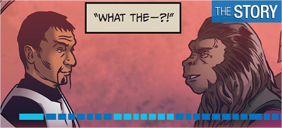
Back on their ship, the intel is revealed and the Enterprise is off to a new location. This new setting was interesting. However, there are four pages of discussion before proceeding further. This drawn out conversation is fine on film, but really seemed to drag. The final three pages have the crew going to the primary location of the mini-series. The ending is abrupt, closing only with visual contact of the inhabitants.
This is a foundation issue, introducing the reason why the two franchises can meet, but outside of the first three pages there’s no ape action. This is a Star Trek adventure only, so far. Next issue I’m wanting some ape interaction.
The visuals by Rachael Stott are very good. The second page focused on Marius and she’s done a really good job on his face and uniform. The action the general is doing in the third panel seems lifted right out of the films and his emotion in the fourth is excellent. I was very happy to see the Klingons of this book be the original series’ versions — no forehead bumps — hooray!
Also neat was the subtle augmentations done to Uhura and Sulu to walk among the Klingons. It was very reminiscent of Kirk in “The Enterprise Incident.” Stott is also adept at having the characters strike familiar poses, including Spock on Pages 9, 14, 15, and 19; Kirk on 11, 14, and 19; and McCoy on 15.
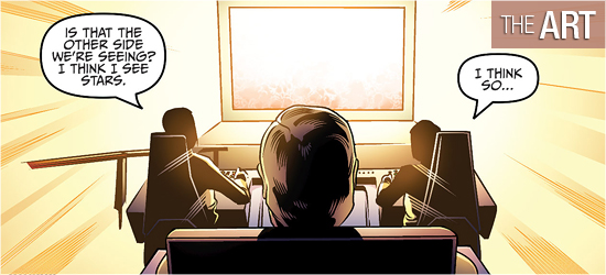
Her bridge is masterfully drawn. Her ships are also well done (Pages 8, 10, 12, 13, and 17), and the devices first shown on 10 outstanding. Based on what’s presented in this premiere issue, Stott is going to make this series look great.
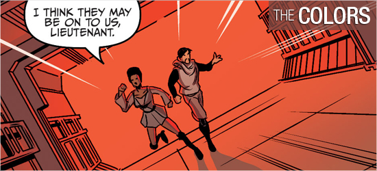
Charlie Kirchoff also does good work on this issue. The meeting that occurs on the very first page happens in a darkened room, but Kirchoff smartly uses a pale violet (which is an excellent color to backlight the general’s dark colors) to denote the dark interior. The scenes in the Klingon base’s interiors are red to make them more tense, with the exteriors being cool blues and greens to calm readers into complicity.
The Enterprise has all the traditional colors one would expect, but the things it encounters in space are cinematically bright to suit their epic scale (Pages 10 – 13 and 17 – 18). Sound effects are also bright (Pages 7, 8, 11, and 12) making them strong.
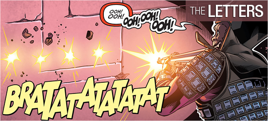
Dialogue, sounds, scene settings, whispers, captain’s log, Klingon translations, a yell, and next issue’s tease come from Tom B. Long. I’m glad he created a specific font for Kirk’s log and I look forward to what how he’s going to present the apes’ cries.