It’s this month’s issue of IDW Publishing’s Star Trek comic series: the third and final installment of “Live,” the next adventure in the new Five Year Mission.
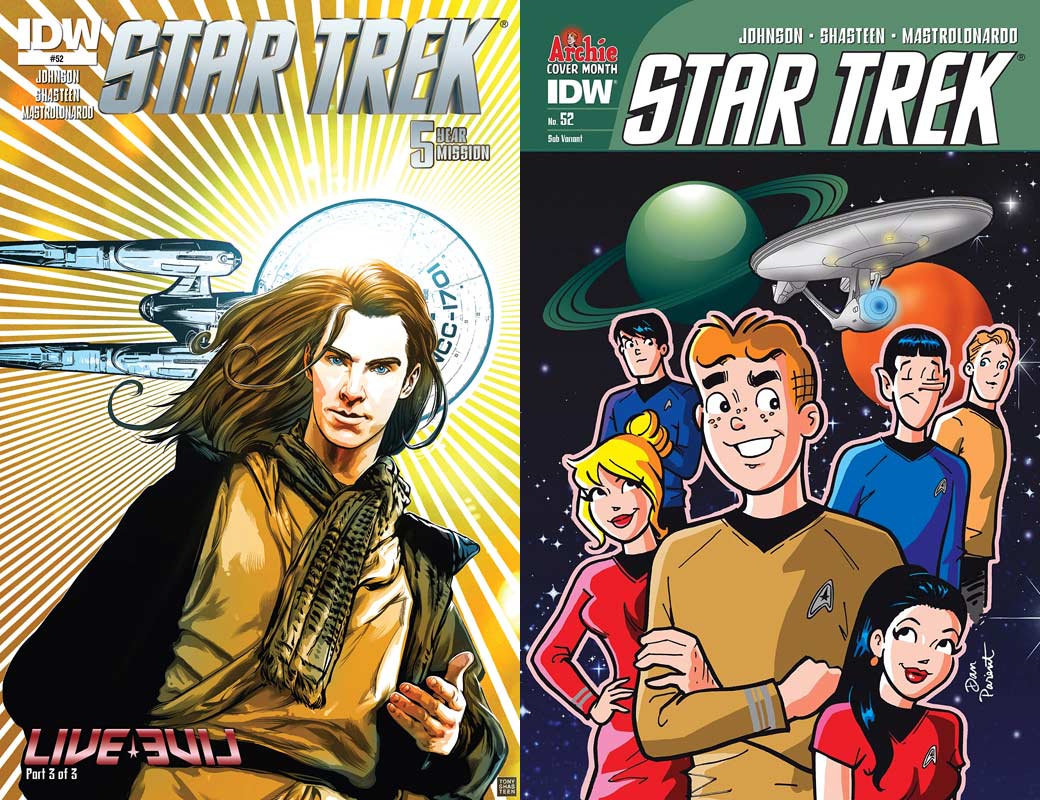
This month’s release brings a pair of covers for “Live, Part 3”:
Order Star Trek #52
- The regular edition, created by Tony Shasteen, features an illustration of Khan, as portrayed by Benedict Cumberbatch in the last film, looking down at the reader as the Enterprise zips behind his head, blocking the sun, creating a dazzling halo effect from his head. The character looks terrific, the ship excellent, and the coloring makes this almost holy to gaze upon. Well done in every way.
- The subscription variant is by Dan Parent, artist of many an Archie comic outing, and this features the Riverdale gang in Star Trek uniforms. Archie Andrews is the largest character, sporting command gold. In front of him is Veronica Lodge as Uhura, and just behind his right shoulder is Betty Cooper as Janice Rand. It appears that Reggie Mantle is Doctor McCoy, while Jughead Jones is obviously Spock.The final cast member looks to be Parent’s version of Chris Pine as Kirk, looking at the others with a semi-smile. Behind the gang is the Enterprise and two planets, all against a starfield. Readers’ love of this cover will depend on their love of Archie characters; I like them, so I like this.
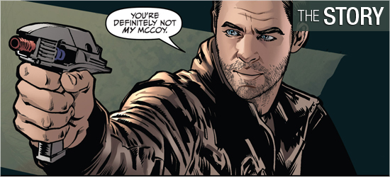
The closing chapter of Mike Johnson’s saga into the Mirror Universe opens in great style with the meeting of two men named James Kirk. The MU Kirk has a perfect response in seeing his doppelganger, while the Kirk readers are familiar with says something equally perfect. The two are kept from shooting each due to a famous Klingon’s intervention.
Khan, who’s also present, now understands why the Kirk he’s met had a negative reaction in seeing him, but still doesn’t understand how how he and his crew arrived in this reality. Uhura tells him it was an ion storm, which the Klingon reveals he’s been monitoring. Our heroes realize they need to get to that storm, but the Mirror Kirk interrupts, “Hello? Did everyone forget about the phaser I’m pointing at you?” Realizing that he needs the help of his treacherous counterpart, Kirk makes a deal.
This was a good conclusion to the story, though it did come off a bit rushed. It could have gone for another issue quite easily. The story moves to Vulcan where both Spocks share a moment, ending poorly for one of them, before returning to Kirk — well, Kirks and company. The confrontation that occurs on Page 11 was expected, though not with such horrific results. The justification on the following page for such action was completely in character for that individual.
One character had been built up in the previous two installments and is taken out too quickly in the fourth panel on 12; I needed this to be much more difficult. The initial reveal on 15 is also too quick, as is the surprise in the fourth panel. This is some pretty dramatic movement, and was too rapidly introduced and resolved within three panels. However, the new danger on 16 was drawn out well and concluded satisfactorily. A solid, but speedy conclusion.
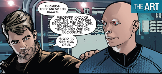
Tony Shasteen finishes up this storyline with his typical aplomb. His character work is tops. His likenesses of the familiar characters are terrific and he’s able to have them emote just as well as the actors who play them on the big screen.
The first introduction to “our” Kirk has him staring at his opposite with a splendid condescending look. Later, Kirk gets worried, angry, and thoughtful perfectly. Spock also looks good, whose silence (such as on Page 6) tells as much, if not more, than the dialogue that accompanies it. Also getting some good appearances was Uhura, whose reaction on 11 is superb; one can hear the tone in her dialogue due to the way she’s drawn.
As outstanding as these characters look, it’s the Mirror Universe characters that steal the show because of their differences. Kirk is the most similar looking of all the characters, sporting only a few days without a shave and a much more rugged outfit. The way he stands is enough to demonstrate to readers his cockiness.
Spock, naturally, sports the iconic goatee, but it is much fuller than the one shown in the classic television episode. He’s an imposing figure in every panel. Seen previously, the Uhura of this universe has a shorter hair cut, slicked down, which makes her much more intense looking. Also shown earlier was Chekov, who had a radically different hair style, but suited this deviant character excellently. The character who appears on 15 is startling; though this individual was eluded to earlier, I don’t see how this reveal can’t be anything but shocking.
The strong character work, though, is again undone by the settings. I cannot understand why they are not as crisp and clear as the characters. They’re okay on the first four pages, though on Page 5 they look like a cut and paste job. Leaving this setting, they improve, but once on the Enterprise they return to the fuzzy, out of focus filler.
Shasteen can make the settings tight, such as when he does so with the captain’s chair on 13, but if anything is more than a foot away from a character it’s a blob: look at all of the backgrounds on 13 – 16. If this is hand drawn, I don’t understand why, after putting so much work into them, an artist would want to blur them? The top panel of the final page is horrific; it looks more Cardassian than Federation.
I’m continuing to find myself liking what Shasteen does with the foregrounds, but the backgrounds are hurting his work.
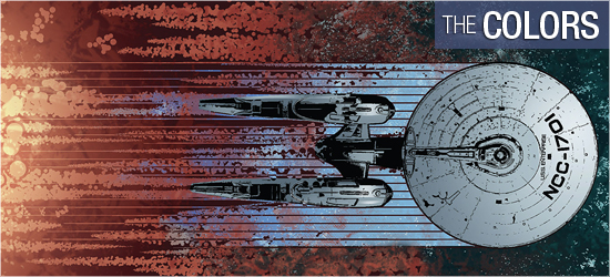
There is some impressive work by Davide Mastrolonardo. His coloring of characters’ flesh is really well done. The first page shows this quickly with both Kirks, and the slick shading on their faces. He also does a strong job on the Klingon; notice the ridge work done on his nose in the first panel on Page 3.
He also does strong work with light sources, such as the computer casting a blue glow on 3 and the shading on both Spocks and their uniforms on 6. The transporter effect on 16 is a dramatic color, and the interiors of the ship that’s on red alert is perfection.
he second panel on 19 depends on the coloring to show the reader where the escaping ship has gone and Mastronlonardo pulls it off excellently with a sudden shift in hues. Excellent work.
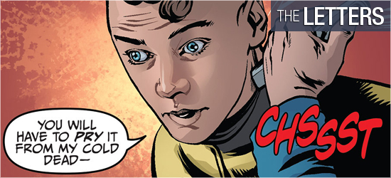
Chris Mowry creates dialogue and scene settings (the same font), sounds, yells, and the final two words for this issue. I prefer to see dialogue and settings be different fonts, but Mowry does a fine job with the sounds, with the one on Page 11 memorable.
One question: Why was there a sound for the action on 10, but not on 16?

