It’s this month’s issue of IDW Publishing’s Star Trek comic series: the first installment of “Reunion,” the next adventure in the new Five Year Mission.
This month’s story offers a pair of cover art presentations:
Order Star Trek #53:
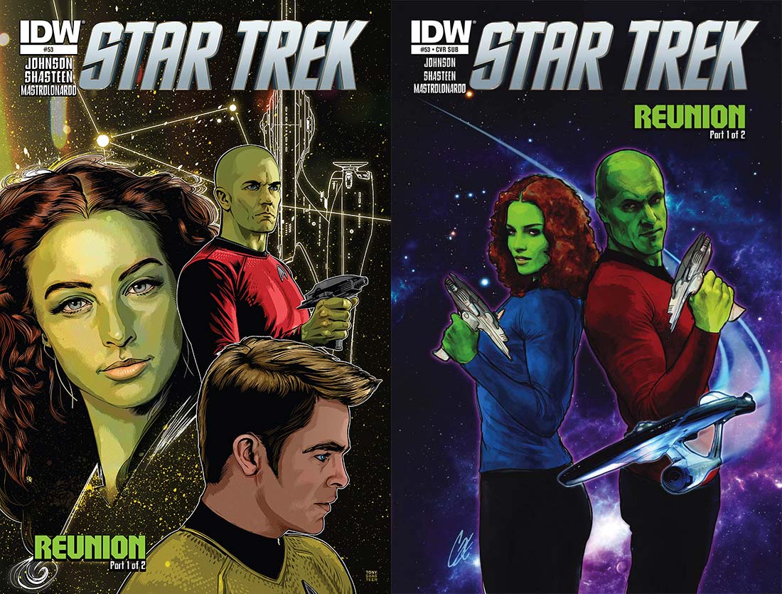
- The first of a pair of striking covers comes from interior artist Tony Shasteen. The dominant image is a portrait of Gaila, played by Rachel Nichols in the 2009 film, on the left side of the cover. Her brother Kai looks determined, wearing Starfleet reds and holding out a phaser out.
Under his image is Kirk in profile, looking as though he’s pondering something weighty. All three characters look great. This trio is superimposed over a shot of space and a blueprint outline of the Enterprise. Everything is great, and having two of the characters being Orions really makes the coloring on this pop.
- Pictured above. The second cover, the subscription cover, is by Cat Staggs. Brother and sister are back to back, each with phaser posed as ready. They are atop a cloudy shot of space than on the Shasteen cover, and the Enterprise is coming out of the top left corner and turning before Kai to take center stage.Good composition on this; I like seeing the two back to back, showing a strong relationship between the two. Gaila has a smile on her face, while Kai has a faint turn of the mouth. It’s rare to see people smiling on comic book covers, so this was nicely warm. The colors are really dark, but it works to make this issue stand out against all others on the stands.

The first five pages of the book are a flashback to fourteen years earlier involving an important moment in Gaila and Kai’s lives. It gives some good backstory to the pair and sets up for fans what troubles to expect. In the present, The U.S.S. Enterprise and the U.S.S. Tereshkova have met in deep space and the crews are mixing to break up the monotony of solitary exploration.
This provides an opportunity for Gaila, who’s a science officer aboard the Tereshkova, to meet with her brother, who’s aboard the Enterprise. Naturally the Orion meets up with Nyota, who offers to show her friend around the Enterprise.
Gaila is quite the popular character online (with her first appearance being memorable), so creating a story around her is a good way to get instant fan buy-in. Writer Mike Johnson does a really good job with fleshing out her past, with the first five pages being a nice look into Orion culture. Gaila’s reunion with family and friends is good, and the moment she meets with a specific individual on Page 10 is as fun as one could imagine.
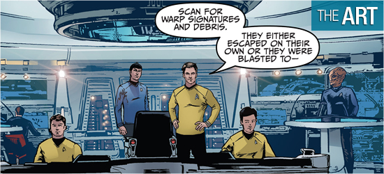
The action on that page is followed up on 11 with the best cut away I’ve seen in a while on this title. There’s a welcome bit of humor in this book before the situation becomes inevitably dire. Page 9 introduces the captain of the Tereshkova and I’m glad to see another captain enter the series, as well as her ship. Hopefully there will be more to see of this captain.
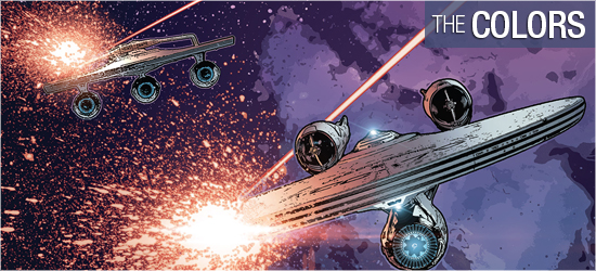
The troubles that both captains encounter isn’t really surprising, given the first few pages, but it was still fun to read, and I’m looking forward to seeing how this story will wrap up next month.
With this issue artist Tony Shasteen has cemented his ability to illustrate believe looking characters, be they the numerous bipeds that populate Star Trek or the bizarre twisting of known creatures into something truly otherworldly.
Page 2 is the perfect example of this, with a pair of Orions, looking very realistic, but a new alien race that seems to resemble something found on Earth, but in a close-up on 3 they have elements that make them absolutely horrific. Readers will have the same reaction as little Gaila on this page after seeing the characters so close.
In the present Gaila looks terrific, with Pages 8, 11, 13, and 14 being stand outs. Galia’s father is also really well done, such as on 4, 12, and 13. Familiar faces Kirk and Uhura also look great, with the captain looking really strong at the top of 18.
It’s the interiors, again, that bring the look of this book down. There’s a difference between photo referenced and photo inserted, and the bridge of Enterprise continues to be a compilation of fuzzy photographs that distract that from Shasteen’s fine figure work. Any panel that shows the bridge is just poor.
The crew lounge aboard the Tereshkova is an interesting design: it looks like Vic’s Las Vegas lounge from Deep Space Nine. I’m really mixed on this location: there would be a lounge aboard a Starfleet ship, but would it be this big and would it look like this? Pages 12 and 13 have a very different setting for this book, but given its location it fits perfectly with the story, regardless of the time period.
I’m liking Shasteen’s characters, but am disappointed in the settings.
It’s such a seemingly simple thing, changing the colors of a character’s skin, but having Orions be major players in this issue brings a pleasurable tone to this book. With the opening five pages, colorist Davide Mastrolonardo does some sensational shading on their skin, both in natural light and during an explosive moment. The colors of the new alien species introduced are superb.
Every character in this book pops off the page, while the backgrounds are a mismash of faded blues and grays. Having an Orion on the page really brings some punch to the colors. One nit with the colors occurs when a red alert is sounded; the backgrounds change to a nice rose, though the crimson hue doesn’t spill onto the characters — This was odd. However, the majority of the book looks very well, save Pages 16 – 18.

Narration, dialogue, and scene settings (the same font), the new alien species’ dialogue, sounds, yells, and the issue’s “To Be Continued!” are crafted by Chris Mowry. Were it not for the coloring of dialogue boxes, it would be impossible to separate narration from dialogue from scene setting. These should be their own unique fonts.
Mowry makes up for this slight with a visually arresting font for the new aliens. Not only do the characters look interesting, their speech looks just as incredible.