It’s the penultimate issue of IDW Publishing’s ongoing Kelvin Timeline Star Trek comic series: the first installment of “Connection,” the next adventure in the new Five Year Mission.
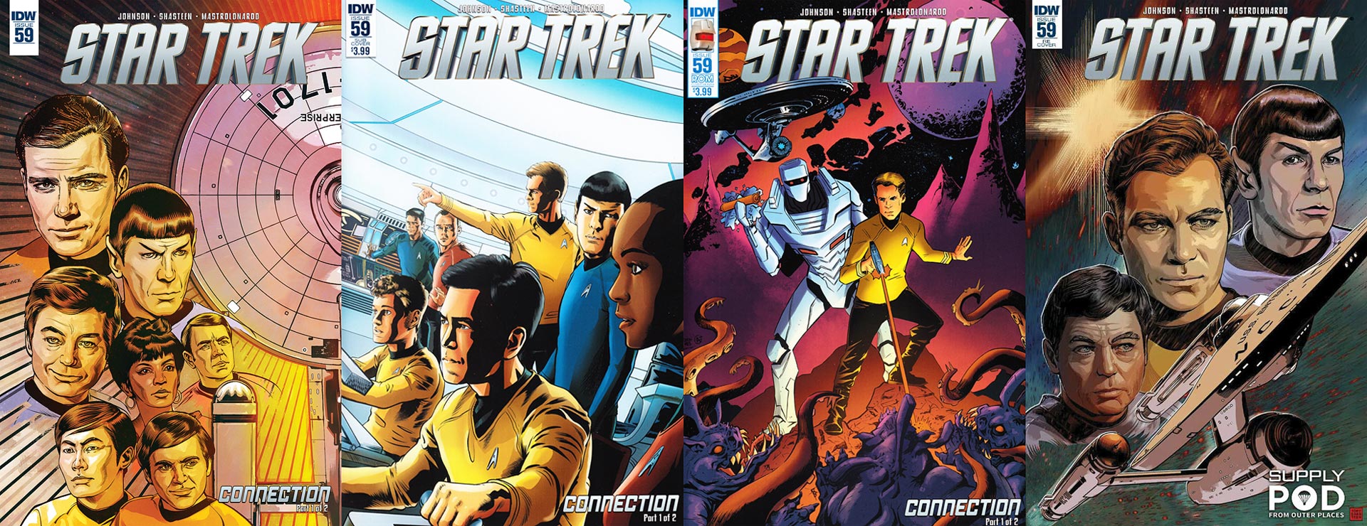
There’s four choices of comic covers to pick from this month:
Order Star Trek #59
- The regular cover, by interior artist Tony Shasteen, is a wonderful surprise. This features the cast of the original Star Trek series imposed over half of the Enterprise. Kirk, Spock, McCoy, Uhura, Scotty, Sulu, and Chekov look terrific, with the good doctor sporting a smile that beams with charm. The coloring is also good, composed of a cool combination of yellows, oranges, and light pinks. This would make an outstanding print.
- The subscription cover is by Josh Adams, with colors by Adam Guzowski. This is also a nice shot of the crew, but this features the current film stars on the bridge looking at something on the viewscreen. Every character’s stance and emotion tells reveals something about them: McCoy leans on a terminal, Scotty looks at Kirk’s action, the captain strongly points forward, Spock turns to watch Uhura, the comm officer’s mouth is agape at the vision, Chekov is startled, and Sulu bites his lip at the unknown. Nicely done. There’s a lot of space between the title and the characters; looks as if Adams misjudged the size of the logo. Still, a good cover.
- IDW Publishing is celebrating the acquisition of the publication rights to ROM, and there’s one featuring art by Drew Moss and colors from Adam Guzowski. I like the Enterprise, the sky, and the monsters threatening ROM and Kirk. The heroes give me a bit of pause. ROM looks much smoother than I remember him being, with his suit almost appearing to be rubber. He’s also got a something in his hand that resembles a stick of dynamite. What happened to his neutralizer? Kirk is just in a funky pose. He’s too calm as he fires upon the horrors before him. I like ROM and I like Star Trek, but I was hoping for something better.
- You’ll have to go online if you want a copy of the Supply Pod retailer variant by Tony Shasteen. This is a beautiful piece featuring the original McCoy, Kirk, and Spock in bust shots above a gorgeous Enterprise. There’s a star flare in the upper left corner that leads to the captain who’s surrounded by his two friends. The iconic ship takes up the bottom third of the cover as it speeds upwards diagonally. The colors, again, are really good on this, with McCoy looking the best and the red splay of energy whipping past the Enterprise gives it an excellent sense of motion. Again, this is print worthy.
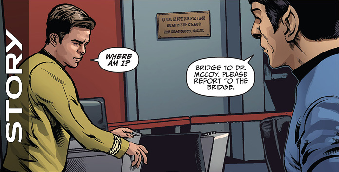
Mike Johnson finally gets to play in the best of both worlds: writing both the new and the old cast, side by side. “Connection” starts with Kirk waking up in his quarters… sort of. The entire issue is split down the horizontal center of book with the original series cast at the top and the film cast at the bottom.
Chris Pine’s Kirk has woken up in the Original Series’ Kirk’s quarters, while William Shatner’s Kirk is in the Kelvin Timeline. Though both characters are essentially doing the same things, this goes beyond a gimmick as Johnson shows the two thinking slightly different thoughts; his writing matches exactly how each interpretation of Kirk would think and speak in this situation.
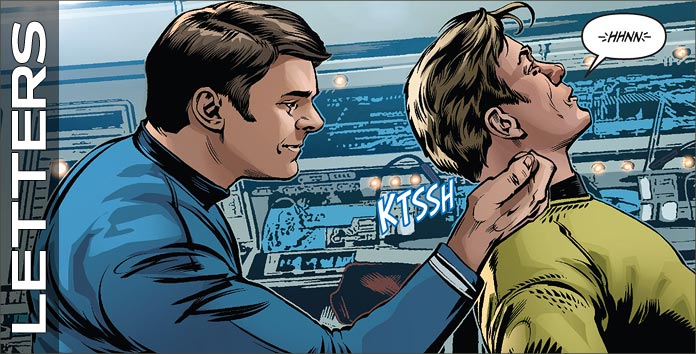
Johnson does an exceptional job with these characters’ voices. Pine’s reaction to his uniform is “the colors and details were off,” while Shatner’s is, “the color are details were…unusual.” This slight tweaking echoes Shatner’s pauses and emphasis on certain words. As each man makes his way to a bridge that’s familiar, yet different, they become more alarmed. The character that each turns to in this situation was fitting, and their reactions to what they see on Page 6 cool.
What happens to each after this are very different, with certain crew members doing something to their obviously ailing captain; the dialogue at the bottom of 8 was spot on!
The reason for this switching of captains is revealed on page 11, and would work well enough for a movie premise. However, Johnson is not content to have just the captain switch places. On 12 many fans will have their longest dreams come true as one crew member goes somewhere not shown before. I laughed, was embarrassed, and felt sad at what occurs to the character at the top portion of the tale.
And it was impossible not to hear the bottom portion of this tale spoken in the actor’s voice. A third crew member also gets swapped, this time for humorous effect, and each behaves exactly as one would expect them.to; their final lines are 16 are perfection. The book has an excellent cliffhanger that leads into this series’ final issue.
Johnson captures each character’s voice and has quite a bit of fun swapping characters.
What an usual assignment this must have been for Tony Shasteen.
First, getting only half the page to be able to communicate each story to the reader, and second, showing essentially the same story, though with one character flipped. This may seem like a simple thing, swapping out a character, but the amount of details that he had to keep track of must have been maddening.
Take for example the first page where Kirk wakes up: the Shatner’s Kirk has quarters that are littered with mementos, while the film version’s quarters would be spotless, and they are. I love all the bric-a-brac that surrounds the Pine-Kirk when he gets up. The look that each character has on his face upon seeing their surroundings starts this tale of confusion excellently.
Shasteen uses each character’s reactions superbly throughout this book; take, for example, when each considers their uniform, their stance in the turbolift, and their final panels on 3 — outstanding.
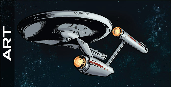
The character work on each page is terrific, with 6’s captains stellar, the smile from McCoy on 7 sweet, the top of 12 beautifully moody, the partner atop 13 and 14 dreamy, and the reactions on 16 great. The exterior shots of each Enterprise are too few, as Shasteen does a good job on these as well, with each releasing an object that’s drawn excellently.
Stylistically, I’m still not happy with Shasteen’s backgrounds, which are very sketchy when compared to the characters that inhabit them. They are instantly recognizable, but should be much tighter. Pages 4 – 7 and 14 & 15 are just too blurry, distracting the reader from the actions of the characters. And, good heavens, what in the world is happening behind Chekov on 19? That effect should have been toned down immensely.
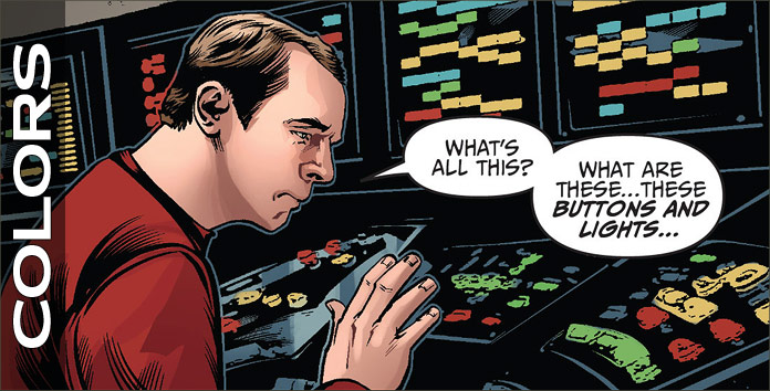
David Mastrolonardo nails the coloring of this book sensationally. The opening shots in the Kirks’ quarters uses many similar colors (flesh and reds), but tweaks them every so slightly to show the differences exist not only with the captains but the colors (Shatner is paler than Pine, and the Original Series’ quarters are darker).
Both men wear the same color of mustard on their uniforms, which unites the pair visually, but their backgrounds are so wholly different as to have the reader join in their confusion. There are a lot of lens flares on the bridge of the Enterprise from the films, and I wish they had been lessened; although this is yet another visual sign for the reader.
The bottom panel on 6 is a particularly slick bit of coloring for a mirror effect that’s sharp. The shots in space are also good, with violets used to show the difference between Treks.
Captain’s (or is that “Captains'”?) logs, sounds, dialogue, yells, communications, and the tease for next month’s final issue all hail from AndWorld Design.
The logs and dialogue are the same font, differentiated only by the shape and color of their dialogue balloons, which works, though I would have rather seen a different font employed. The communications, which appear on 19 use a different font and balloon shape, so it could have been done with the logs. The yells are done for humorous effect and they are funny.
The opening alarms to wake the Kirks are different, which is a slick way to tell the reader that this will be a story about slight differences. Nicely done.