I’m a big fan of super-fan writers Scott and David Tipton, who manage to bring not only a high degree of accuracy to their portrayal of the characters from Star Trek: The Next Generation this next chapter of Terra Incognita — but also a degree of authenticity as well. After all, they live this stuff, as their lifestyle shows.
There is no disputing their writing talents, but it’s just great to see fans who have the breadth and knowledge to sustain their writing abilities as they continue to create incredibly entertaining stories for other fans (like me) in a medium that requires a specific type of mindset and love.
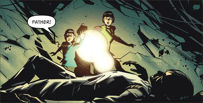
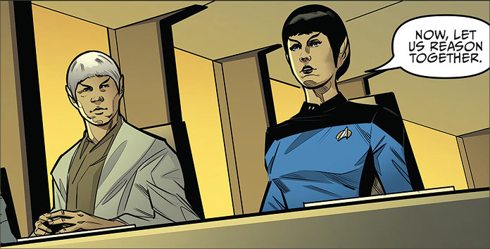
After all, who else but well-versed fans would even think about basing a story around a one-time, relatively obscure character like Doctor Selar? Played by frequent Trek guest star Suzie Plakson in TNG Season 2’s “The Schizoid Man,” the character’s background is entertainingly explored in this issue. We see more about the Vulcans’ acceptance of their emotions in trying times and in my mind, I’ve always felt that made them more believable.
I loved this story. I am a sucker for a Mirror Universe story, and one of the great subplots in this comic is the Mirror Barclay establishing himself in this universe. It’s one of those story features what will not only establish longevity in this series but add a degree of anticipation for future stories, wherever the Tiptons plan on going with this series.
That in itself not only shows their talent but their awareness of how to sustain a story and work with a publisher to perpetuate an already successful franchise.
Even the dialogue is exact. When I read this comic, in my mind I hear the lines as if they were read out by the actor playing the character. I used to be a “Theatre Kid,” as my eldest daughter reminds me, and I tend to read dialogue in text out loud. The frame of reference I have to compare is the episodes of TNG, so I find myself paying strict attention to the intonation, cadence and pronunciation of each cast member, having met a number of them in person, I can tell you that I have first-hand knowledge of how they speak.
That’s the accuracy I look for in a work of fiction derived from any Star Trek series. In this case, it’s TNG and that is the realm of expertise the Tiptons have, and so, their work reflects that degree of familiarity and expertise. It’s exactly what IDW needs in terms of presenting these characters, and I’d dare venture, they are the consulting artists that IDW needs to coach any prospective writers in this area.
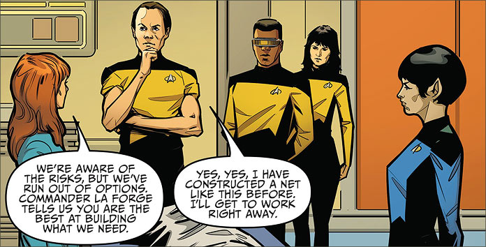
As an example, look at the way that the Tiptons present Beverly Crusher. Her dialogue is laced with not only futuristic medical jargon, but also with a sense of professionalism and concern that Gates McFadden would channel into her performances. This is a character that every TNG fan knows, but we get the same degree of care and precision when they present Selar, an obscure character that only a real fan would know.
Regardless of her popularity, she is thoroughly represented in this story and that makes it both an entertaining story but a true Trek story.
But let’s look at the art for this book, starting with the covers.
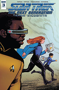
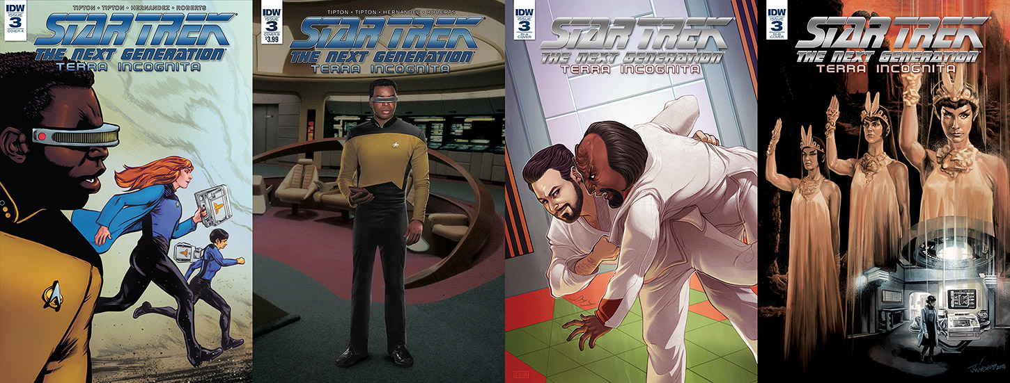
- Cover A is by Tony Shasteen, a Star Trek artist whose work I’ve always been astounded by. In this case we see a motion piece with Dr. Crusher and Selar in the background rushing towards an emergency with Geordi La Forge in the foreground. It’s a little frivolous, but hell… it’s Tony Shasteen; a blot on a napkin would bring a poignant pause for reflection.
- Cover B is a photo cover of Commander La Forge. I’m just not a photo cover guy. I know that there are people who want to see photo covers, but I can’t help but shake the feeling that this is a holdover form the old pin-up days when young readers would cut pages out of their comics and post them on their bedroom walls.
- The retail-incentive Cover A is a pretty cool martial arts sequence with Commander Riker and Lieutenant Worf sparring. It looks like a Judo or Jiu-Jitsu match by Elizabeth Beals. You have to love Riker’s smirk as he flips Worf. It’s a fun cover.
- However, the retail-incentive Cover B cover by J.K. Woodward has to be the one that really sends this comic. A painted image of the priestesses of Mt. Selaya, including Dr. Selar as one of them. I love this cover. Not only does it specifically relate to a central plot element but it is an excellent tie-in to classic Star Trek, when we saw these priestesses in Star Trek III. For me, it’s a perfect cover that represents the story and Star Trek.
Angel Hernandez’s interior art is always enjoyable. But I love the camera-like views in this book that also ties it into a television viewing experience. The perspectives are very reminiscent of watching the show and with the dialogue and awareness the writers have for this series just reinforces this sense.
It pays to be a geek – particularly when said geeks are providing appreciation and entertainment for their fellow Star Trek brethren and sisters. The Tiptons know what they’re doing and this is a thoroughly enjoyable story for said fellow geeks to get into.